Last week I presented Interactive a Grid Deep Dive for APEX Office Hours where I demonstrated a new version of the IG Cookbook.
The video and slides are now available. The presentation covered important aspects of the Interactive Grid architecture. As promised I’m making the latest IG Cookbook (release 4.0) for APEX 18.2 available for download. As always make sure you install the Sample Interactive Grids app first because it creates some needed tables.
There are many exciting additions and improvements.
New sample pages added:
Column Help: This page shows how to display the column help in a tooltip on the column header. Example of an async tooltip including caching. Also shows a trick for getting the current focused column.
Wide Report: This examples shows how to deal with the issue of having to scroll to the bottom of a page to access the horizontal scroll bar.
Master Detail: This page demonstrates how to put an Interactive Grid into an Inline Dialog region and how to disassociate the detail region from the master so that the detail model instance is only set on demand. It also demonstrates how to deal with the IG master detail limitation where it is not clear which details have been edited and if there is a validation error in any of the detail record edits the user has no idea which one it is. There are two versions of this page one that saves changes when the detail dialog closes and one that saves all detail edits with the master.
Lazy Tabs: This shows how to make interactive grid not load and render any data until the tab it is in is activated. This helps improve page load time when there are many interactive grids on the page. There are two versions of this page. One scrolls the whole page and the other has a fixed size page and each tab has its own scrollbar.
Tabbed Record Editing: This page shows how the model can be used independently of the Interactive Grid UI. It allows editing any number of employee records each in their own tab.
Summary of changes:
Many fixes and improvements were made to the Rich Text and Custom Popup page. The Custom Popup plug-in is updated. It now supports inline popup or inline dialog region templates. It supports multiple inputs and outputs. Search is improved in the popup that contains an Interactive Grid. There is a separate demo page for the Custom Popup plug-in.
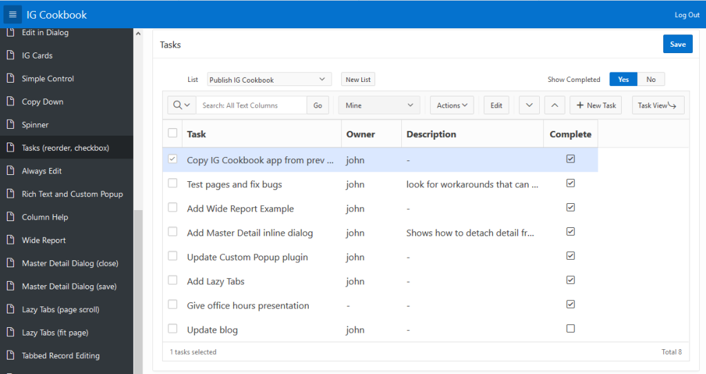
The Tasks page now supports Alt+Up and Alt+Down keyboard shortcuts to reorder selected rows. Previously the grid widget was blocking those keys.
The Tasks page has a number of fixes and improvements including a checkbox column. This is something people have been asking for since Interactive Grid first came out. The checkbox works in both edit and navigation mode.
Most of the code for the Tasks page has been moved to files tasks.js and tasks.css. Because this page became a more complete and compelling example of multiple techniques the code grew larger than would fit in the declarative JavaScript code attributes.
The IG Cards page has improvements to the way search is handled. Each search replaces the previous one rather than add a new filter. The report settings area is only shown if there are other filters.
A number of pages that update an inline modal dialog or popup have been updated to use the new (not yet documented) apex.theme openRegion and closeRegion methods.
The Windows List View Style page had some CSS rules updated because the hover checkbox broke due to changes in markup for grid widget pseudo selection checkboxes.
Copy Down page was changed to use the grid widget methods rather than custom code to go direct to the model.
The Spinner page needed to have the jQuery UI file path updated for new jQuery UI version.
The Update Selection page has a minor improvement to Increase Salary inline dialog region. How dialogs are opened and closed is updated.
The Custom Row Height page needed a CSS fix so that the column items would be vertically centered in the tall cell. Also updated to reflect the new automatic handling of heading height.
The Variable Height Rows page is updated to change the way the Notes column is truncated. This works now because a hidden column with Value Protected = No can be updated in the model without getting a server error.
Cell Style Based On Data was updated because the grid widget now responds to highlight metadata changes. The refresh is no longer needed.
A number of fixes were made to the Double Grid page.
Made the left side nav wider using Theme Roller.
Added new updated template for inline popup region.
Added new region template for jQuery UI Tabs.
There is an install validation to check that the needed tables exist. Hopefully this will catch people that install this app without installing Sample Interactive Grids first.
You can read about and download the previous IG Cookbook version here.
Feel free to discus the techniques shown in this app or issue with this app on the APEX Discussion Forum. This is not an officially supported sample but I’ll reply if possible and you can all help each other as well.
There has been a good deal of buzz around using APEX for Progressive Web Apps (PWA) lately thanks to the excellent work and presentations by Vincent Morneau. You can and should read his Turning APEX into a PWA document. Here I want to share my thoughts on building PWAs with APEX; the possibilities, limits and challenges. This post is less researched and more quickly written than most of mine but not really shorter. It is not based on any actual implementation or hands on investigation. As a member of the APEX development team I must emphasize that this contains my own opinions. Any forward looking statements about APEX are purely speculative and not part of any official statement of direction.
A place I was recently with no cell service.
Vincent has pointed out that Interactive Grid and Interactive Report do not work offline and cannot be made to do so because they internally make ajax calls to the server. This is true but it is just the tip of the iceberg. The following are some of my bigger concerns.
APEX is multi-tenant and this works against the web’s same-origin policy. Consider apex.oracle.com, APEX sees it as 38,000 some odd workspaces and 100,000 plus web apps but the web sees one web app. APEX and the Oracle Database keeps all the workspaces and their schemas isolated. But on the browser there is no built-in separation. The browser considers all the apps from all the workspaces on an APEX instance to be one, which means it assumes they all trust each other. So browser features like named windows, Local/SessionStorage, and IndexedDB will let any app access the data of any of the others. This has serious security and privacy consequences. APEX has APIs such as apex.navigation.popup and apex.storage.getScopedSessionStorage to keep apps from stepping on each other but it is advisory only; it cannot be enforced. (Note you don’t have to use these browser features.) Because an offline PWA uses IndexedDB something will be needed to keep apps separate. Either some web-tier magic is needed so the apps are in their own origin or you have to deploy one app per APEX Instance. Perhaps there is something that ORDS can do to help. I don’t know. I should point out that this issue is not unique to APEX but would apply to any multi-tenant web platform.
PWAs require specific files to be at the root of the web URL. APEX doesn’t provide direct access or control over the web tier. It may be that creating a PWA will always require configuring the web server. Again ORDS may be able to help.
Vincent describes the “app shell” as the set of resources that need to be cached. This is where the APEX architecture works against the PWA in a fundamental way. APEX page resources mix data and static/structural presentation. Server side conditions and other logic affect what parts of a page are rendered. This means that the same page resource can be, and generally is, different each time it is requested. APEX pages are not a shell they are the whole egg (or turtle?). Think about a simple address book app. The address edit detail page as rendered by the APEX engine would contain input fields (page items) for things like name, address and phone number but these fields would also have values based on the current entry being edited. The field values are not part of the shell. In addition the page may be used for both edit and create in which case there is likely some server side conditions to choose between rendering a create button or an update button. If this page resource gets cached you have also cached data for a particular entry. When it is time to use this page offline you need to write code to replace the values with the actual entry data to be edited. Or you have to cached a copy of the page for each entry. If you go this route it is not really a shell that is being cached.
In contrast the architecture of modern JavaScript frameworks is quite different. Data and presentation are separate. The page resource is essentially static. The client makes a separate REST ajax request for the data. The data is stored and manipulated in a client side data model that is bound to the UI. This is a high level over simplification as there are many different frameworks, each with their own peculiarities. The main point is that separating the data from the presentation in this way makes it easier to implement a PWA. The page resource is static and suitable for caching. The client already has the logic for updating the UI so that it shows the current data. All that needs to be done to support offline is switch to get the data from indexedDB rather than an ajax request.
APEX has made some architectural changes in this area. In release 5.1 Interactive Grid introduced a client side data model. This separates the data from the presentation. The data is fetched from the server as JSON, stored and manipulated in the model, and presented and edited in the IG UI. The binding between the model and various views such as grid, single row, icon, detail and chart is handled automatically. (Note: the fact that the JSON can be part of the page resource is an optimization that can be turned off.) The APEX JET Charts also have a data model as this is a necessary part of using JET visualizations. I hope that this architecture is used more going forward.
Although currently IG cannot be used in a PWA mainly because of the ajax requests associated with saved report settings, architecturally it is in a better position than most other parts of APEX to support offline PWAs in the future. This is because of the separation of data and presentation. What needs to be done is to switch between the APEX server and indexedDB according to online status for saved report settings and to synchronize the settings. The local report settings would also be used when fetching offline data from indexedDB into the IG model layer. These are changes that APEX would have to implement. However the modular components that make up the Interactive Grid region such as the model and grid widget could potentially be useful in a PWA today. I say potentially because I have not tried it yet. The question is does the model API have the necessary methods for fetching and saving the data in indexedDB. I am very open to improving the APEX model layer in this area.
This sounds hopeful for the future of Interactive Grid but what about other parts of APEX? The model is designed to handle forms (a single record) and trees as well as reports. These are not currently exposed in any APEX region but you may be able to do it yourself. Keep in mind that for reports the model and tableModelView widget can do just about anything that Classic Reports can do and in a way that keeps the data and presentation separate. The IG Cookbook has an example on page IG Cards that demonstrates a card style report. This could also be done with a model and tableModelView cutting out the IG region to avoid its current PWA unfriendly behavior.
What is missing in APEX for general data and presentation separation is client side templates and data binding. Since 5.1 APEX has client side templates (see apex.util.applyTemplate) but they are as limited as APEX server side templates. One nice property of APEX templates is that they are logic-less and this is a property that I think should be maintained. Some people have used Knockout or other client side template and/or binding libraries. The problem with these in an APEX context as I see it is they require creating a model layer in JavaScript and because they are back-end agnostic require writing code to populate and store that model. This is not something that I think APEX developers should be required to do. The APEX model when integrated as part of an APEX plug-in is a declarative client side model that doesn’t require custom client or sever code. If APEX had richer template syntax that worked on the client and declarative data binding to the APEX model that would be a huge advantage for PWAs and would reduce the amount of dynamic actions needed for dynamic client side presentation updates.
Currently saving the APEX model only works with the Interactive Grid. I hope this changes in the future. Either by making it possible/easy to create your own DML process for your model based region plug-ins or not hard coding the Automatic Row Processing (DML) process to the Interactive Grid region. See the IG Cookbook Tabbed Record Editing page for an example that uses the model and simple two way data binding.
Hopefully I have made the advantage of separating data and presentation, having a client side data model and doing client side rendering, clear in the context of a PWA. Next I want to look at different kinds of data in terms of state. I like to divide the state data into two categories; conversational state and application or persisted state. Application state is what gets persisted in a database for reasonably long periods of time. For example, in an address book app the application state is all the addresses. It can also include users and their preferences. Conversational state is data that is needed while the user is interacting with the app. It is everything from current focus element, selection state, scroll offsets, current pagination offset, current active tab, collapsible region or tree control expansion state, to user entered data that needs to be remembered from one page to the next. An important feature of APEX that has been around since the beginning is session state. APEX keeps item values in session state so they are not lost due to the stateless nature of HTTP. Session state values can also be passed from one page to the next in the APEX URL. The distinction between application and conversational state is not always clear. Is a shopping cart conversational or persistent app state? It depends and can be argued both ways. The point here isn’t to nail down the definition exactly but to point out that JavaScript applications, especially single page apps (SPA), keep just about all their conversational state on the client. This means that when it is time for them to go offline they only have to worry about application state not conversational state. Because APEX apps keep most conversational state on the server extra work needs to be done to support offline use. I’m not sure if there is a general solution here. I think the best thing to do is to limit the use of APEX session state in a PWA app.
An issue related to session state is session state protection. APEX protects various values rendered in pages or in URLs from changing by using a checksum. For example consider a simple product purchasing UI. The user is shown the product, price, quantity, and total. The quantity is a number field or select list and the user can enter or choose a different quantity (all the other values are display only). There is client side code such as a dynamic action to recalculate the total when the quantity changes. When the page is submitted the server recalculates the total from the quantity and price given to it. Without session state protection the user could modify the price (by using the JavaScript console for example) and end up paying less than they should. The session state protection checksums let the APEX engine trust that data from the client has not been modified. The alternative would be to not use the price value that comes from the client (in fact don’t even submit it) but instead read it from the database again. Being able to trust the protected data that comes from the client improves performance by cutting down on extra reads from the database.
If protected values are stored locally such as in indexedDB while the app is offline even if the checksum is also stored it may not be possible to successfully save the data back to the server once the app is online again. It depends on if a new session is established when going back online. Buried in this whole concern over session state is the question just how will sessions be maintained and reestablished by APEX PWAs?
I gave a very simple example but checksums are used in many places in APEX including on URLs, URLs that open dialog pages, and interactive grid model data. How session state protection behaves or could behave when there is the possibility of going offline requires much more thought and investigation. Simply turning it off every where in your app just to support offline should not be done without carefully considering the security implications.
A JavaScript web app written in some other framework probably doesn’t have this session state protection checksum problem. Remember these types of apps get and save their data using REST resources. Hopefully these REST resources are implemented to not trust any data that comes from the client. So in this example the REST resource would only receive the quantity from the client. The price would be fetched from the database again to calculate the total. (In reality the price may be cached in some web-tier object store.) The point is that this is another example of how other architectures may have an easier time supporting offline compared to APEX.
My final though is synchronization is hard. Simply saving and replaying ajax requests is not data synchronization. If you add a contact to your address book while offline and then delete it while still offline, it makes no sense, once back online to send a request to add and then another to delete the contact. The same is true if contacts are edited multiple times. The database just needs to be synchronized to the final state. And the synchronization goes both directions updating the server with changes made while offline and also updating the client with the latest data from the server. I also feel that in an APEX app you shouldn’t need to define separate web services to support offline use. There is no reason why ajax calls can’t be made to APEX. Ideally this would leverage the normal APEX ajax code paths. If using the APEX model this includes validation. A big part of the app design for offline is going to be deciding what data to make available offline. It is probably unwise to replicate the entire database into indexedDB. Perhaps just the user’s data, or just the data from the last few days or weeks, or just data related to a specific project etc. The user may choose what to make available offline or perhaps whatever they have been looking at most recently is transparently written through to indexedDB. There are so many possibilities. When you do synchronize there can be conflicts. APEX already has built-in support for detecting conflicts using either row values or a version column. However the longer the time between fetching the data and saving it means the more chance for others to make conflicting edits. It will be even more important to provide ways for the user to correct the conflicts and save without having to completely redo all their changes.
Many of my concerns have been about offline use but as Vincent points out offline is only one piece of what it means to be a PWA. The main aspects of a PWA are:
Installable: The app can be installed and resources cached for better performance. This is progressive meaning that the web app still works without being installed or on browsers that don’t support PWAs. Being installed makes the web app feel more lake a native app with features such as a home screen icon, full screen etc.
Responsive: The app works well in different form factors from phone to desktop. Universal Theme is already good at this. There are specific region types like the Reflow Report designed to be responsive and ideally we will continue to improve responsive capabilities throughout.
Offline: The app can still work when there is no network connection. How much of the app can be used offline is going to depend based on app purpose, user needs, and effort to make it work. There is always going to be some effort involved in making this work. It is not clear to what extent APEX can make this easy/declarative and for which use cases.
Notification: Web push and notifications API allow the user to receive notifications from the app even when it isn’t running. APEX has good support for sending emails but who uses email these days? Well I still do but some users may prefer this.
When you are telling the APEX team you want PWA support be specific. Let us know what aspects of PWA technology you need the most.
So will this happen; will APEX support some or all aspects of PWA technology? If so which and when? Should we even bother? I hear some people say this isn’t even something that APEX needs to support; let other frameworks worry about that. Often it is a specific statement about offline and how the world is getting ever more connected. This may be true but there are exceptions. The web site Mountain Project is a good example of where offline is useful. It is a guide to outdoor rock climbing and many rock climbing areas do not have Internet access. It is not a PWA but instead has an app for Android and iOS. It could have gone the PWA route I suppose. Before you head out to the crag you download the area of interest and then the app works while offline giving you all the climbing route info.
I have no idea to what extent if any APEX will embrace PWAs but I do have an opinion. I think that it should if for no other reason than I believe that APEX should be able to do anything that other web platforms/frameworks can do. It could be that in the future being a PWA is simply what is expected when you claim to have good mobile support.
Let us know your Progressive Web App use cases and needs and how you would like to see APEX support them.
Today I will show how easy it is to put JET Spark Charts in Interactive Grid cells. JET Spark Charts are an implementation of the sparkline graphical style. I recommend learning about them from Edward Tufte’s books.
Rather than just give a recipe I’ll take you through my process of figuring things out in the hopes that it does more to educate than to confuse. My starting goal was to simply get a static spark chart displayed on an APEX page. To a blank page I added a Static Content region with this markup in it:
I learned the markup from the JET cookbook and oj-spark-chart element documentation. I only gave it an id so I could mess with it from the JavaScript console if needed. I figured the class may come in handy since I saw the JET examples using inline styles. I ran the page and got no errors and also no spark chart. This is expected because the necessary JET libraries are not loaded.
For most libraries that you want to play around with in APEX you simply list the needed library file(s) in the page attribute JavaScript File URLs. You can either reference them from a CDN, or your own web server, or you can load them as application static files. Then you can start using the library from anywhere on the page or even from the JavaScript console. But things are not so simple with JET. JET uses RequireJS to load specific modules and their dependencies. I have written about using RequireJS, JET, and APEX before and since then APEX has added the [require requirejs] and [require jet] JavaScript file URLs prefix syntax to make it easier to use JET with APEX.
So we know that we need to use this [require jet] syntax but the question is what file to load. Well it should be your own JavaScript file that contains a call to require such as:
require([ list of modules needed ], function() {
   code that uses the modules
});
The trouble is that I don’t expect using spark charts to need much code and to just play around with it seems like creating a file shouldn’t be necessary. But some file is required. It can even be an empty file. Yes it is true in the end you may, and probably should, turn your experiments into a plug-in or at least move the code into files for greater reuse and modularity but it is nice to be able to try things out with as little setup as necessary. This means putting code inline on the page and even running code from the JavaScript console.
You might be tempted to try loading the combined JET file oj.js reasoning that it contains everything so it should provide what you need to use any given JET component. I have never gotten this to work! There are many 3rd party dependencies that need to be loaded and even after that I still get errors about missing symbols. I have given up on this because oj.js is huge, I don’t need most of it, and I don’t want dependencies like Knockout anyway.
Sometimes, depending on what JET elements you want to use, simply having an APEX component that uses JET on the page provides the necessary setup. Doing nothing more than adding a JET chart to the page is almost enough to display the spark chart. Well it did something because now there is a warning in the console that it failed to load knockout.js.
What is going on? I’m not using Knockout so it shouldn’t try to load it. Notice that the above markup uses <oj-spark-chart>. This is a custom HTML element (also known as a web component or JET Custom Element). This is very different from the old widget style of component initialization where you would have a normal HTML element like div or span and then turn it into something with code such as $("#selector").someWidget({...}). Custom HTML elements are initialized automatically. They are configured with attributes rather than an options object. By default JET uses Knockout to bind dynamic data from a data model to various attributes. But this can be turned off and you can see that all the attributes in the markup above are static values so no binding is needed. To turn off Knockout data binding the element or any of its ancestors needs to have the attribute:
data-oj-binding-provider="none"
I think in the future APEX may put this attribute on the page <body> element automatically. You could do this today by modifying the page template. You could also add the attribute to each JET element but this would become tedious. The simplest thing to do is put it in the page attribute Page HTML Body Attribute. The following code in the page attribute Function and Global Variable Declaration or in your own JavaScript file will do the same thing:
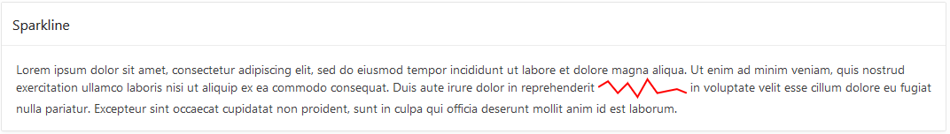
To summarize I started with a blank APEX page. Added a Static Content region with markup given above. Then added a JET Chart region as a trick just to get the JET libraries loaded. And added data-oj-binding-provider="none" to page attribute Page HTML Body Attribute. To make the sparkline fit in a little better in a paragraph I added the following inline CSS:
The result, without a single line of JavaScript code, is this region:
Considering that a sparkline is “a small intense, simple, word-sized graphic” putting it inside a paragraph like this is a reasonable use case. But my ultimate goal was to put it in interactive grid cells and I’ll get to that shortly. First there are two problems with what I have shown so far 1) the sparkline data values are hard coded, and 2) there is an unwanted chart on the page.
You can probably think of a number of ways for APEX to generate different data to render on the server side. The data should be formatted as a JSON array. It could be generated by a PL/SQL Dynamic Content region, or use a substitution, or use a Display Only item. A region plug-in doesn’t make sense for Spark Chart but an item plug-in could make sense for some use cases. But as this paragraph example shows Spark Charts can be used in many places where items don’t make sense. For now I’ll leave creating a Spark Chart item plug-in to someone else.
If you want to set or change the data on the client side it is easy to do with code such as:
You can change the item values any time you like after the element has been initialized. Note the [0] after the jQuery object. This is because web components extend the methods and properties of DOM elements. You could use this equivalent code:
I said you can set the items array property after the element is initialized but when is that? If you want to set the items as soon as possible after the page loads and the element is initialized you will need to wait on a JET busyContext. For example in Execute when Page Loads you could do something like this:
require(["ojs/ojcore", "ojs/ojchart"], function(oj) {
    var sparkLine1 = document.getElementById("sparkLine1");
    var busyContext = oj.Context.getContext(sparkLine1).getBusyContext();
    busyContext.whenReady().then(function() {
        sparkLine1.items = [1,3,2,4,5,6,1,4,3,4,5,34];
    });
});
Now lets get rid of the unwanted chart. As we have seen it doesn’t take any code to initialize the Spark Chart so the question is what is the minimum necessary to get the needed JET libraries loaded. It turns out not much. Create a file called sparkchart.js with this one line as the content:
require(["ojs/ojchart"], function() {});
Then add it to Shared Components > Static Application Files and add a reference to the file in the page attribute JavaScript File URLs like this:
[require jet]#APP_IMAGES#sparkchart.js
This feels like a waste of a round trip to the sever for such a small file. If you already have an application JavaScript file consider adding this line to it. It seems like APEX should do something to make simple things like this easier.
To the page CSS File URLs add:
#JET_CSS_DIRECTORY#alta/oj-alta-notag-min.css
Now you can remove the Chart region. Taking a step back and realizing that once the JET libraries are loaded the Spark Chart is just markup it should be clear how to add them to Interactive Grid or other kinds of reports.
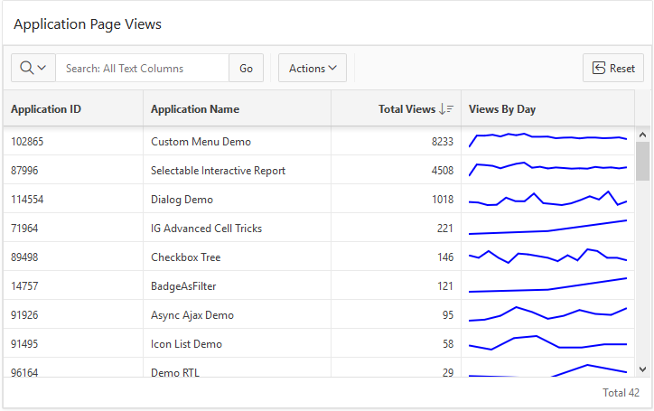
Here is an example. Add an Interactive Grid to the page with Title = Application Page Views. Set the SQL Query to:
select
    application_id,
    application_name,
    (select count(*) from apex_activity_log where flow_id = ap.application_id) total_views,
    case when (select count(*) from apex_activity_log where flow_id = ap.application_id) > 0 then
        (select json_arrayagg(views)
             from (select trunc(TIME_STAMP) day, to_char(TIME_STAMP,'mm/dd/yyyy') day_format, count(*) views
                 from apex_activity_log where flow_id = ap.application_id
                 group by trunc(time_stamp),to_char(time_stamp,'mm/dd/yyyy')
                 order by trunc(time_stamp) desc))
    else
        '[]'
    end views_by_day
from apex_applications ap
This uses json_arrayagg to create the JSON array. If you have a database version less than 12.2 then you will have to make due without json_arrayagg. I managed to figure out how to use lastagg. It was a lot of fun learning and figuring out how to use the new JSON database capabilities. Figuring out this SQL query was the hardest part for me. Feel free to tell me how it can be done better.
Run the page as is just to see that the Views By Day column contains a JSON Array of numbers.
The last step is to change the VIEWS_BY_DAY column type to HTML Expression and enter this expression:
That is essentially all it takes. I changed a few other IG declarative attributes and added the following CSS rule so the sparkline would fill the whole cell.
.cell-spark {
    width: 100%;
}
I also I tweaked the report settings. The result can be seen in the screen shot at the start of this blog. It should be clear how Spark Charts can be used in Interactive Reports and Classic Reports. I nice thing about the IG implementation of HTML Expression columns is that the template is evaluated on the client so only the data is sent to the client not all the markup repeated for each cell.
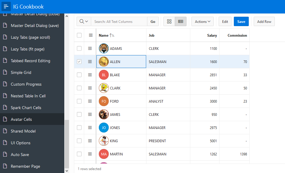
It should be possible to do something very similar with the JET Avatar element but it seems to have a dependency on knockout that can’t be shaken.
Have fun adding these new data visualizations to your APEX apps.
Note this contains information about a future release of APEX and the final release may differ from what I describe.
I previously described how to create inline popup regions but with the upcoming APEX 19.1 release that should no longer be necessary because the Universal Theme should have a built-in Inline Popup Region. You can try it out already on the APEX Early Adopter site. Here I will provide up to date information on inline popups and dialogs.
APEX has had inline dialog regions since release 5.0 but they were overshadowed by the modal dialog page. I have always felt that inline dialog regions are not used as often as they could or should be. Now with the upcoming 19.1 release I think most of the pieces are in place to make it practical and easy enough to use inline dialogs and the new inline popups.
First a brief description of inline regions and modal dialog pages and the distinctions between them and also what a popup is.
The inline dialog and inline popup regions are like any other region. You create them by choosing the appropriate region template “Inline Dialog” or “Inline Popup”. They are rendered by the server and included as part of the HTML page that is sent to the browser. What makes them special is that they are not initially visible; they are turned into a dialog or popup widget when the page loads. Most normal page templates include a layout position called “Inline Dialogs”. Typically these inline regions are put in that position because it helps to hide them while the page is loading. You need to provide a way for users to open and close these regions with dynamic actions or JavaScript code. Once the region is open the user can interact with the region and form items or sub regions. Changes to page items in the region are not saved until the page is submitted. If needed you can load and save data using dynamic actions or JavaScript code.
The modal dialog page is a complete APEX page that loads in an iframe that is inside a dialog widget. The rendering and processing of the dialog page can leverage the full power of the APEX engine. The dialog is opened with a URL. The URL is actually JavaScript code but you create links to the modal dialog page with the Page Designer link builder or using the APEX_UTIL.PREPARE_URL API just like any other APEX page. The dialog is closed with either a dynamic action (Cancel Dialog or Close Dialog action) or the Close Dialog process.
A popup is different from a dialog in these ways: It is always modal, does not have a title bar and cannot be resized or moved. It may have buttons that close it but it also closes when you click or touch outside of it or press the Escape key. It may be positioned near the artifact that caused it to open. Popups are commonly used in mobile apps.
Comparison between inline regions and modal dialog pages.
Inline Dialog and Inline Popup are APEX page regions.
Modal Dialog pages are full APEX pages.
Both modal dialog pages and inline dialog regions are implemented with the jQuery UI dialog widget.
Inline popup regions are implemented with the APEX popup widget which is derived from jQuery UI dialog.
An inline dialog region can be modal or non-modal but a dialog page is always modal. A non-modal dialog page is actually a separate browser window. There is no APEX page that is a popup (it makes no sense because popups should be lightweight).
A submit button in a modal dialog page submits the page (the one in the iframe in the dialog). The parent page remains unchanged.
A submit button in an inline region submits the page (the dialog content and the parent page are the same page).
Inline regions open very quickly. This is because they are already rendered on the client; there is no round trip to the server.
Modal dialog pages are slower to open because they must request the APEX page from the server.
Modal dialog pages are always opened in the top level APEX window (browsing context) so when they are stacked (Dialog: Chained = No) they can be moved anywhere on the page.
Inline dialogs and popups are always opened in the window they are in so if you add an inline dialog or popup to a modal dialog page they cannot be moved outside the modal dialog page iframe. This is why the modal dialog page templates don’t include the “Inline Dialogs” page position; inline dialogs are not that useful/user friendly inside modal dialog pages (but it is possible if you really want to do it). There may be added confusion for an inline popup region because clicking outside the popup to close it (regardless of noOverlay setting) only works for clicks in the same iframe. Clicking anywhere outside the iframe does nothing.
The chained concept does not apply to inline dialogs or popups (because it has to do with how navigating to a new dialog page is handled). However it is possible to implement wizard like behavior in an inline region simply by showing and hiding content as the user “moves” through the wizard.
Universal Theme has a new region called Inline Popup as described above.
Both Inline Dialog and Inline Popup regions have a new template option “Remove Body Padding” that does just that. When the popup or dialog contains a large region such as a chart or interactive grid you probably don’t want the body padding. This removes the need for custom CSS that I had used to remove padding in the IG Cookbook when putting an interactive grid in a dialog.
The popup widget has a new option (noOverlay) that handles click outside to close without using an overlay. This is exposed as the inline popup region template option Remove Page Overlay. An overlay is what makes the dialog or popup modal and it makes the page “behind” the dialog look dim. It handles any clicks outside the dialog. For a popup the difference between using the overlay or not can be subtle. One thing is that the page is not dim with no overlay. The other is that with no overlay click outside the popup closes it and the click will also activate what it clicks on rather than being eaten by the overlay. Making noOverlay work in the presence of iframes was tricky. This option is motivated by the enhanced Popup LOV that is planned for a future release past 19.1.
Finally, built-in dynamic actions Open Region and Close Region that will open and close Inline Dialog and Popup regions. People have been asking for this for a long time.
Bonus: Open Region and Close Region work on collapsible regions as well to expand and collapse them.
The apex.theme openRegion and closeRegion APIs that I mentioned here are planned to be documented. These APIs implement the Open Region and Close Region dynamic actions.
Before APEX 5.0 some themes included some kind of primitive dialog support and these themes tended to have global functions called openModal and closeModal. These functions were never official parts of the APEX core library and were not officially documented. Universal Theme includes functions with the same name for backward compatibility but they should be considered deprecated. Ever since 5.0 when all our our dialogs switched to use jQuery UI dialog I have recommended to use the dialog open and close methods. For example $("#dialogid").dialog("open"). This is a bit long winded so starting in 18.2 the apex.theme namespace has openRegion and closeRegion functions. These should be documented in 19.1. In addition there are new Dynamic Action actions Open Region and Close Region that are based on these functions.
A nice thing about these new functions (or dynamic actions) is that they work with more than just dialogs (that is why the are not called open/closeDialog). As already mentioned they work with inline dialog, inline popup, and collapsible regions. In fact they should work with any region that is implemented with a jQuery UI widget that supports either the open and close methods or the expand and collapse methods. So if you implement a region plugin or region template that has similar functionality and appropriately named methods it should automatically work with these new dynamic actions and apex.theme functions.
The steps for incorporating an inline dialog or popup are now very simple:
Add a Static Content (or other type) region to the Inline Dialog page position. You can put
whatever you like in the region.
Change the template to Inline Popup or Inline Dialog. Set template options as you like.
Create a button somewhere on the page to open the dialog or popup.
Create a dynamic action on the button and use action Open Region, selecting the inline region.
If you like you can add a button to the inline region to close the dialog or popup. Use the
Close Region dynamic action for this button.
For this simple case there is no JavaScript required. More advanced topics will have to wait for another time.
We have converted most places in our sample apps to use the new functions to open and close dialogs. Hopefully we will get more examples of using popups and the new dynamic actions to open and close regions. The IG Cookbook has examples of inline dialogs or popups on pages 9, 11, 24, 25, 26, and 29. In addition the Custom Popup item plug-in included in that app works with either inline dialogs or popups. I hope to have an update to the IG Cookbook for 19.1 that uses the new DAs and the built-in inline popup region.
I hope to see more APEX apps using inline dialogs and popups going forward.
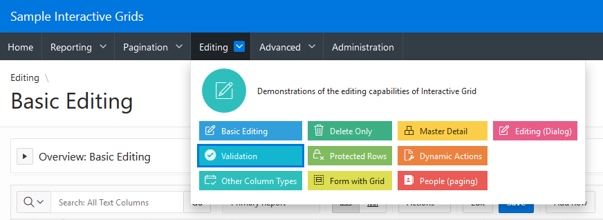
During a recent APEX office hoursSven Weller asked a very interesting question about styling top navigation menus. The question was elaborated on in this forum post. There are a lot of details in that thread but the short answer is the out-of-the box top navigation menu doesn’t allow arbitrary markup or individually colored menu items. However the menu widget has many features and here I will show how to create rich custom content menus like the following.
Menu bars, drop down menus, and popup menus have been around since the beginning of graphical user interfaces. There is value in consistency of look and feel so that users can immediately recognize and easily manipulate the menus. The APEX menu widget tries to follow as closely as possible the design guidelines for traditional desktop menus. This is why they don’t have icons in the menu bar and don’t allow different colors, etc. But in the wild west of web UI anything goes. As a result there are a number of bad web based menu designs and implementations. This isn’t to say that web designers haven’t come up with new effective UI; they have and some of the patterns have found their way back into desktop platforms. One of those patterns is the mega menu. There are a number of variations of mega menus and some are better than others. A nice thing about sticking with traditional menus is that you know they will be usable and accessible. For example the APEX menu fully supports keyboard navigation including typing characters to go to the next menu item that starts with that character.
To support mega menus, the APEX menu widget has a custom menu content option. I showed how this can be used to implement a custom popup mega menu but it also works with menu bars, which is the subject of this article. To be clear the menu bar itself does not allow custom markup but the drop down menus do. This way you get standard menu bar behavior such as right and left arrow key navigation, open on hover once opened, and the overflow menu on small screens. With custom content comes the responsibility to make sure that the drop down menu is usable and accessible but at least the basics like keyboard handling come for free.
Here are step by step instructions for creating an app like the one pictured above. It would be nice if there was an easy way to share a single template but the choices are to export a whole theme or a whole app. The steps seem long because I have to show all the template HTML but it is really quite simple and there is no new JavaScript. It is mainly just a new list template that is needed.
1. You will need an application to try this out on. I used the Sample Interactive Grids app because it already had interesting nested menus. It is a good idea to make a copy of the application.
2. Change the app to use top navigation. Go to Shared Components > User Interface Attributes > Desktop > Navigation Menu. Set Position to Top. For now leave the default list template Top Navigation Menu. If you run the app now you will see the normal APEX top navigation menus.
3. Copy the Top Navigation Menu template to a new template called Top Custom Menu. Go to Shared Components > Templates. Find the Top Navigation Menu and click the copy button. Then change the app to use this new template. Go back to the navigation menu settings from step 2 and change the List Template to the new Top Custom Menu. If you run the app again you will see that nothing has changed because we haven’t modified the template yet. The next few steps will modify the new template.
4. Edit the template. Go to Shared Components > Templates and click on the newly created Top Custom Menu. There are a number of changes to make so it can be helpful to check the Return to page checkbox.
5. This first change isn’t really necessary for the custom content menu but I think there is room for improvement in the built-in top menu template. I think that the menu bar should have a nice id like the side navigation tree does. The #PARENT_STATIC_ID# is not very useful when the list template is used for the navigation list (rather than a list region) as is intended for this template. At the same time the JavaScript code can be improved. It needs to use the new id and there is no need to check for apex.actions because it is always available now. I also think that the “NEXT” tabBehavior is more appropriate for this kind of menu.
Change the List Template Before Rows attribute to:
var e = apex.jQuery("#t_menuNav_menubar", apex.gPageContext$);
if (e.hasClass("js-addActions")) {
  apex.actions.addFromMarkup( e );
}
e.menu({
  behaveLikeTabs: e.hasClass("js-tabLike"),
  menubarShowSubMenuIcon: e.hasClass("js-showSubMenuIcons") || null,
  slide: e.hasClass("js-slide"),
  menubar: true,
  menubarOverflow: true,
  tabBehavior: "NEXT"
});
6. Change the template markup. This is the most time consuming part especially when you are trying to figuring out the markup and style for the custom menus. The general idea is to use the menu markup data-custom="true" attribute on the top level list entries that have sub items. Then in the sub items we can put just about any markup we want. Here I choose to borrow some classes from the Universal Theme cards. Some of the summary information (icon and description) is placed in the top level list item even though it will show up in the drop down custom content menu. The data-icon attribute is removed from top level list items because, as the console debug warnings will tell you “Menu bar items cannot have icons.” No worries, the icon is put to good use in the custom content menu. In a later step attributes are defined for the #A06# description and #A07# color class.
Next are the sublist entries. These are simpler because the data attributes used to create a menu from markup don’t apply. The current menu indication isn’t supported so the current and non-current templates are identical.
Change the Before Sublist Template Before Rows attribute to:
<ul class="menu-items u-colors">
Note the use of Universal Theme classes like u-colors. This is used to assign a default color to each menu item.
Change the Sublist Template [Non]Current attributes to:
Change the Sublist Template After Rows attribute to:
</ul></div></li>
7. Add descriptions for the new attributes. Set #A06# to Description. The text of this attribute is shown at the top of the mega menu. Set #A07# to Color Class. This lets you specify the color of the menu item. If you don’t provide a color class then a default color is used just like the UT cards templates. Both of these attributes only apply to the sub list items. And the other attributes #A01#, #A02#, #A03#, and #A05# only apply to the top level list items.
That is the end of the template changes. If you run the page now you will see the drop down menus but they will look all messed up. This is because a number of CSS rules are needed to get the desired layout.
8. Add the needed CSS rules. Normally if you just have a few CSS rules you can add them to Cascading Style Sheet Inline attribute but there is currently a bug that keeps the CSS attributes from being rendered when the template is used for the navigation menu list. Another option is to put the CSS in a file. This can actually be a better idea because then the file can be cached by the browser.
Create a file called customMenu.css and add the following CSS to it:
Then upload the file to Shared Components > Static Application Files.
Add the reference to this file #APP_IMAGES#customMenu.css to the User Interface Details. Go to Shared Components > User Interface Attributes > Desktop > Cascading Style Sheets and add it to the list of File URLs.
9. The final step is to update the navigation list to take advantage of the capabilities of this new list template. Because I started with a copy of the Sample Interactive Grids app I edited the Desktop Navigation Menu list to add icons for all of the sub list items. For all the top level list entries that have sub entries add a description in the A06 user defined attributes. You can set specific colors for the menu items using a UT color class such as u-color-12 in A07.
Now when you run the app you should see drop down mega menus. I performed the above steps on a copy of the Sample Interactive Grids app on apex.oracle.com, which is currently on APEX 18.2. You can try out the results here. No authentication is needed and all editing has been disabled. The general technique should work on earlier versions perhaps even 5.0.x. I haven’t tried it myself. The big difference is going to be in Universal Theme so changes may be needed to the markup and CSS.
I also applied the same steps on the upcoming 19.1 release. That is where the above screen shot comes from. The differences in look are because of changes in Universal Theme menu styles. I think the 19.1 menus look better.
This is just a simple example of custom content (mega menus) in APEX. In the hands of a skilled web designer a wide range of amazing different looks should be possible. Just change the list template markup and CSS to suite your needs.
I hope that a future releas of APEX has some kind of mega menus built-in but even if that happens there will still be uses for your own custom templates when what APEX provides doesn’t satisfy your needs.
There are some limitations to this kind of menu. There is no nesting of sub menus at least not in the fly-out or popup sub menu sense. This example does not work with more than two levels but it may be possible with different markup to support nesting of menus. For example the 2nd level list items could be a group or category label and the 3rd level are links in that group. But the mega menu by design is always a single popup even if the links it contains have some structure. Another limitation is that the current menu designation (data-current) on sub menus doesn’t work. The same is true for other menu from markup settings like data-id or data-disabled. This makes it much harder to associate these mega menu sub menus with actions.
The advantage is much greater control over the markup and style. The markup is used as is rather than being turned into menu option configuration. This can be seen in title attribute tooltips that actually work whereas for the built-in top navigation menu the Title Attribute #A04# does nothing and is pointless.
If you try out mega menus in your app share a picture.
Application Express 19.1 is now available and I have updated the IG Cookbook to reflect fixes and improvements to Interactive Grid in this release as well as adding 6 new example pages. Download IG Cookbook (release 5.0) and give it a try. If you are still using an older version of APEX you can try the latest out at apex.oracle.com or try a previous IG Cookbook release. As always make sure you install the Sample Interactive Grids app first because it creates some needed tables.
What’s new in Interactive Grid
There are no major enhancements for Interactive Grid in this release. I hope that in the future its priority will rise and we get to fulfill the original vision of Interactive Grid as a super set of Interactive Report. The main new thing is a small number of declarative attributes to replace what previously required advanced JavaScript configuration. However there were many internal changes, fixes, and improvements primarily in the interactiveGrid widget and the areas of master detail handling, view interface, and chart, icon, and detail views. Hopefully this release has improved the overall robustness of Interactive Grid.
For much of the 19.1 development cycle I was working on the new Popup LOV, which didn’t make it into this release and is now targeted for 19.2 (keep in eye on the statement of direction). Some of the modules that make up Interactive Grid are used in the new Popup LOV so a few minor beneficial side effects from that work made it into 19.1. The noticeable changes include:
The tableModelView widget now has a focus method that delegates to iconList. This simplified the Interactive Grid implementation of icon and detail views and is consistent with other widgets that take focus.
The grid widget control break column need not have a header or label and there is a new option collapsibleControlBreaks.
While not related to Interactive Grid but on the subject of Popup LOV motivated changes the item interface has these enhancements:
The removeValue method is now documented and takes the value to remove as a parameter.
The addValue method now includes a displayValue parameter.
There is a new refresh method
You can also thank the Popup LOV work for the popup widget noOverlay option, which is not documented but is exposed in the new Inline Popup region Remove Page Overlay template option.
I’ll let this stoke your imagination of what the new Popup LOV item may be like.
See the release notes for more info about what is new, and changed and what published bugs were fixed.
Something that I’m very happy about is the JavaScript API Reference has graduated from “Pre-General Availability” and is now a full replacement for the old JavaScript APIs chapter of the API Reference. There are some newly documented APIs such as the apex.theme namespace as well as new functionality. The interactiveGrid widget doc is still missing a number of options and methods but now at least some of the interactiveGridView interface is documented. Most of the new stuff is in support of Interactive Grid.
The apex.util.getNestedObject function makes it easier to work with Interactive Grid configuration options. Recall that the options passed into the Advanced: JavaScript Initialization Code may or may not include nested objects. In order to assign values to properties on objects that don’t exist you need to create the objects first. So rather than doing this:
if (!config.views) {
    config.views = {};
}
if (!config.views.grid) {
    config.views.grid = {};
}
if (!config.views.grid.features) {
    config.views.grid.features = {};
}
config.views.grid.features.stretchColumns = false;
New methods are added to the toolbarData array returned by copyDefaultToolbar. The toolbarRemove and toolbarInsertAfter methods make it easier to customize the Interactive Grid toolbar.
Other API improvements related to Interactive Grid are mentioned in the following sections.
What’s new in the IG Cookbook
This is a major improvement to the IG Cookbook app. It has the usual tweaks and fixes including improvements to the notes that describe each example page. It makes use of new APEX features such as the Close Region and Open Region dynamic actions, Inline Popup region template, new declarative attributes, and the apex.util.getNestedObject API. See the Change Log on the Home page for details.
Some of the existing examples are updated to demonstrate improvements made to Interactive Grid behavior or make use of new APIs.
The Lazy Tabs examples demonstrate that lazy loading, waiting until the IG is visible to load data, now works for the chart, icon, and detail views. In the past the chart view did not obey the Lazy Loading attribute at all and would always request new data even if Lazy Loading was No. The chart view now also uses the Messages: When No Data Found attribute.
The Custom Row Height with Image example demonstrates that the icon view no longer needs advanced JavaScript code for multiple selection; it takes the selection configuration from the Row Selector column attributes just like Grid View.
The IG Cards example added a sort button which demonstrates that now the icon and detail views can be sorted. I think this fix is very important because it makes these views actually useful now.
The Master Detail Dialog pages now use the new interactiveGrid widget option, trackParentSelection, and new method setMasterRecord in place of the previous hack that relied on disabling an event and using a private, internal method.
There are 6 new examples. The two I think are most exciting are Simple Grid and Shared Model. But first a brief description of the others:
Simple Cell Style: This was motivated by this APEX forum thread. Seeing the workarounds that used JavaScript code to add or move styles or classes from the inner element to the table cell element made it clear that there should be a better way even though Interactive Grid already has a way to set cell styles from model metadata. The new grid widget column option cellCssClassesColumn lets you use the value of a column from the SQL statement as the classes for the current cell. This is much simpler than using the model metadata. It is also often better than using an HTML Expression column type or cellTemplate column option because the classes are added to the cell (td) rather than an element inside the cell.
Custom Progress: This is the result of people on twitter asking for more control over displaying progress and the bug fix for the save action not having any progress at all. New options were added to various APIs to make this possible. The model.create function now has the makeLoadingIndicator option and the interactiveGrid widget has saveLoadingIndicatorPosition and saveLoadingIndicator options.
Nested Table In Cell. This is not as cool as it sounds. I added this example just because there were previously some assumptions made inside the grid widget that caused it to get very confused if the cell contained table markup. Now that this is cleaned up a cell can contain table markup but I’m not sure how useful that really is.
Spark Chart Cells: This is an example of something I previously wrote about.
Simple Grid
From the questions I get about Interactive Grid I think many people want to customize it. Sometimes it does too much; they want to make it simpler for their users. In this case there are many declarative and advanced options to turn features off. Sometimes it doesn’t do enough and there are ways to extend it with new actions and toolbar buttons. Until now if you wanted a very simple grid report primarily for scroll pagination and frozen columns, which are unique to Interactive Grid, you would start with the Interactive Grid region and customize away all the features you don’t want. No chart view, no toolbar, no saving reports, no flashback etc. But now that the APEX widgets like grid are documented it is in theory possible to create your own plug-ins that use the widgets to do just what you want. Just as you could do for any third party widget. This Simple Grid page demonstrates the Simple Grid plug-in that puts the theory into practice.
I don’t expect that you will use the Simple Grid plug-in as-is but instead as a starting point for your own plug-in. If nothing else it can serve as an example of a region plug-in using the new APEX_EXEC API. Because it uses APEX_EXEC it can support Remote Database and Web Source locations, although I don’t include an example of that. See also Carsten’s blog about using APEX_EXEC in a plug-in.
Simple Grid supports most of the grid widget options with declarative attributes. There is no concept of saved reports. Instead most settings are configured at design time. If you want to allow the user to customize settings you can add code to the page to do that by calling the grid widget API. Changes to column configuration, such as width or frozen state, can be persisted in client session storage. Sorting is hooked up to the grid column header behaviors. It has a simplified column header menu for showing, hiding and freezing columns. It also supports lazy loading. UI for filtering is not built in so you can create any kind of UI to support your filtering needs. In this case I use an inline popup that lets you configure up to 3 columns to filter on. Filters are set programmatically with apex.region().setFilters. (There is nothing stopping plug-ins from adding their own methods to the region interface.) Of course this is just an example of what is possible and you can use this as a starting point to create all kinds of grid region plug-ins. Some things are left for you to do. For example saving the current sort orders or filters if you want and supporting links in columns. The big thing missing is editing. With the new additions to APEX_EXEC in 19.1 that were added to support the new Form Component it may be possible to add editing to a model based plug-in. I hope in the future model based plug-ins such as this can participate in master detail in a standard way. Until then it may be possible to support Simple Grid being either a master or a detail by adding your own plug-in attributes.
Because Simple Grid doesn’t have saved reports it only takes one ajax request to change the sorts or filters and get new data. Interactive Grid currently uses two requests one to save the report settings and another to get new data.
Something that Classic reports can do that Interactive Reports and Interactive Grid cannot is have a SQL Query returned by a PL/SQL function where the set of columns could be different each time. Every once in a while someone asks for this capability in Interactive Report and now Interactive Grid regions. The reason this can’t be supported is because of saved report settings. These regions have knowledge about the fixed set of columns that is needed in order to save reports. Even now that Interactive Reports supports attribute PL/SQL Function Returning SQL Query it is required that the columns remain consistent.
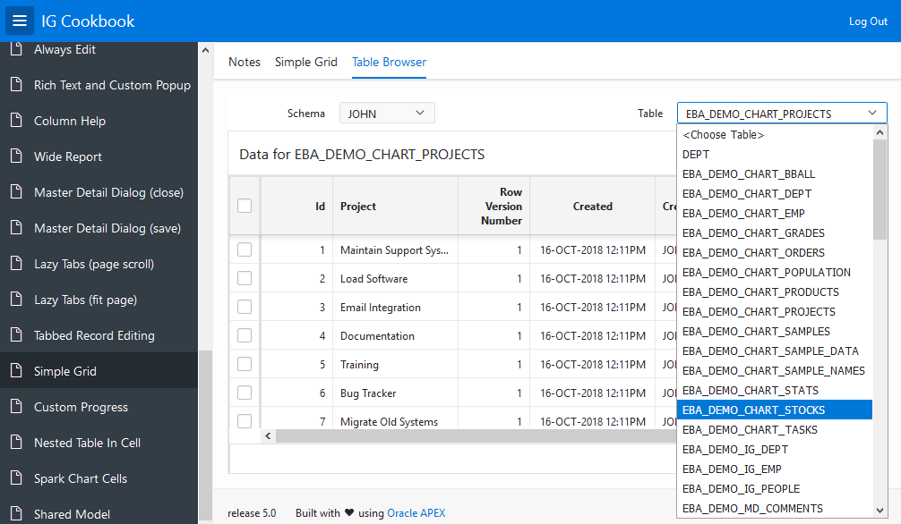
So if you wanted a single report where the columns can vary but also with grid features like frozen columns and scroll pagination you were out of luck until now. Simple Grid, by virtue of using APEX_EXEC and not having saved report settings can handle reporting on arbitrary tables. See the Table Browser tab of the Simple Grid page.
Just about everything this plug-in does uses documented APIs with the following exceptions. You may need to dig into the code to understand these better and they carry more risk of changing without notice in the future.
Model option callServer. This undocumented option is used so that a single request can be used when the columns change. In the future there may be a better way to accomplish this.
Function apex.widget.util.onVisibilityChange. This is something that any size managed component plug-in should use in order to work well with APEX region display selector (tabs), collapsibles, and dialogs. I have written about this in more detail here.
Function apex.widget.util.onElementResize. This allows a component to respond to size changes in its containing element.
Shared Model
This example is experimental. One thing I have learned about what users expect out of Interactive Grid is that any edit they make they want to see reflected elsewhere in the UI right away. For example if they have a sum aggregate defined and they make an edit why isn’t the total updated right away. There are various reasons why this is not trivial. One place where edits are not reflected immediately are in the icon and detail views. However if you change data in the grid view and then look at single row view you see the changes right away. The reason for this is that the grid and single row (this is the recordView widget) share the same model. When the model changes all the views of that model are updated. The icon and detail views each have their own separate models. This was done so they could all have their own distinct sort orders just like the report, icon, and detail views of Interactive Report allow. However it was only in this release that sorting works for the icon and detail views.
This page demonstrates experimental options that let you share a single model between the grid, icon, and detail views. My opinion is that it is more import for edits to the data to be consistent across all views than it is to allow distinct sorting for each view. But it probably depends on the use case. If you have an opinion on this let us know. I hope one day sharing models is a declarative option. Another disadvantage of separate models for each view is that the data is transferred and stored for each view. This results in extra bandwidth and client side memory use.
An advantage of having a single model is that it allows for more responsive possibilities. You can try this out on this page. Shrink the window to a small size and notice that it automatically changes into icon view. If you make it big again it goes back to grid view. This is not something that is built into Interactive Grid but rather some custom code on the page.
The detail and icon views are implemented by the tableModelView widget. This widget was improved in 19.1 to support updating the view when the model changed programmatically.
I hope these new examples help people to use Interactive Grid in new and interesting ways in their apps.
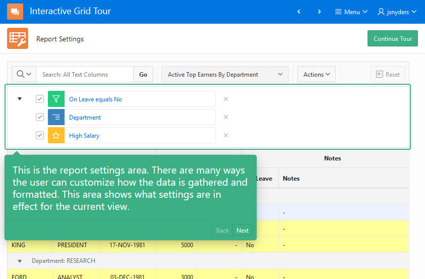
At Kscope 19 in Seattle and APEX Connect in Bonn I presented a beginners session on interactive grid where I demonstrated an app that gives a guided tour of the interactive grid features. As promised I’m making the app available. It uses the same data as the Sample Interactive Grids app so make sure that is installed first. Then download the Interactive Grid Tour. If you are new to interactive grid this app is a good introduction to what it can do. It takes a different approach compared to the Sample Interactive Grids app in that it guides you through just about all of the built-in capabilities with a series of popup notes.
Even if you are already an expert on IG the app may still have some value for you. Have you ever wanted to make sure users are aware of some new feature in your app. You have probably seen apps that do this. After an upgrade they will popup a note or notes that point out some new things. There is a reusable widget in this app that does just this.
Here’s the scenario: You have a popular app that has been in use for years. The users are very familiar with it. You have added two new features that they get to from buttons on the home page but you are concerned that users won’t notice because their navigation patterns are so ingrained. You want a popup to educate them about the new features when they use the app. This is what the showMe widget is for. Making use of this widget will require some JavaScript and CSS skill.
Here are the steps to make use of it in your own apps:
Download the tour app and install it. Run the app to get a feeling for what showMe can do.
Go to Shared Components > Application Files and extract (download) the IGtour.css and showme.js files.
The styles needed for showMe widget are in the IGtour.css file. Copy all the rules after the “Show-me classes” comment into your application’s CSS file. What, your app doesn’t have it’s own CSS file? Hmm. Must be a very straight forward app. No problem. You can add a new CSS file (recommended) or simply copy the rules into the page CSS inline attribute on any pages where showMe is going to be used.
Go to your app where you want to add a tour. Or create a new app just to try this out.
Go to Shared Components > Static Application Files. Upload the showme.js file and the file where you added the CSS rules. I’ll assume it is called app.css.
Now go to Shared Components > User Interface Attributes > Desktop.
In JavaScript File URLs enter:
#APP_IMAGES#showme.js
In Cascading Style Sheets File URLs enter:
#APP_IMAGES#app.css.
If you added the CSS rules to an existing file that is already loaded then this last step isn’t needed. Note: If you are only adding a tour to one or a few specific pages then you could load these files just on those pages. The general idea is that these two files need to be loaded on any page where you want to give a tour of your app features.
Go to the page where you want to add the tour. I’m going to assume that there are two buttons on this page that represent the new features to call out and their static ids are “feature1” and “feature2”. You can substitute any jQuery selector you like in the tour steps and even add more steps (See step 7).
Add an inline popup region to the page. Add a Static Content region to the Inline Dialogs position and set the Template to Inline Popup. Set the title to “Tour”. The title won’t be seen. Set the templates options: Remove page Overlay and Set Dialog Size to None. The showMe widget uses the popup functionality but doesn’t include it so that you can customize the popup to fit your needs. Note: you won’t use the apex.theme.openRegion API with this popup region.
The tour is driven by markup added to the popup. Add the following to the popup region Source Text attribute.
<ul class="show-me">
    <li data-element="#feature1">
      Press this button to make a random person on the Internet a little happier today.
    </li>
    <li data-element="#feature2">
      Press this button to be <em>5% more</em> productive.
    </li>
</ul>
The show-me class causes this list to be turned into a showMe widget automatically when the page loads. Each list element is a step in the tour. The content of the list element is shown next to the element identified by the jQuery selector in data-element. Other attributes used to control the showMe tour steps include: data-name, data-position, data-zindex, data-width, data-height, data-url. The position attribute controls the popup position relative to the element and can be one of “below” (default), “above”, “left”, “right”, “inside”, and “center”.
Add a dynamic action to start the tour when the page loads.
Name: start tour
Event: Page Load
Add one Execute JavaScript Code action and Add this code:
$(".show-me").first().showMe("nextStep");
Add a Next button to the Next button position in the popup region created in step 6. Set the button name to TOUR_NEXT and the label to Next. Add a dynamic action to go to the next step of the tour. This looks a lot like the one in the previous step.
Name: next step
Event: Click
Select Type: Button
Button: TOUR_NEXT
Add one Execute JavaScript Code action and Add this code:
$(".show-me").first().showMe("nextStep");
Now run the page and you should see the first tour popup. Click next to see the next tour step.
See the Interactive Grid tour app for more advanced uses. It defines a number of actions and dynamic actions on the global page (page 0) because the tour is used throughout the app. The actions let you use keyboard shortcuts. The showMe step options doBefore and doAfter let you handle advanced situations where the state of the page needs to be set before the step can be shown such as selecting a tab or expanding a region. The logic to open a menu so that a tour step popup can point to a menu item is complicated and not very robust. The code for it is in the IGtour.js file.
It would be easy to add a “don’t show me this again” checkbox to the popup and save that state as a hidden page item backed by a user preference. The page load DA that starts the tour would only start it if the user hasn’t checked the box. There are many other possibilities for starting or continuing the tour.
Read the showme.js source code comments to learn about the options and methods it supports. You will probably want to modify the CSS for the popup for example to change the colors.
Because the showMe widget is driven by simple list markup it would not be unreasonable to create an APEX list template for it. I did not do this because the list is specific to a given page, contains sometimes complex jQuery selectors, and doesn’t leverage app URLs much. So I found it much more convenient to simply author the list markup right on the page.
When I created showMe I wanted to leverage the popup widget as much as possible. One thing that was missing was the callout – that little triangle that points to the element that the popup is related to. So I added the callout functionality as part of showMe. Shakeeb and I liked it so much that we added it to the APEX menu and popup widgets and hopefully this will be in 19.2. So this showMe widget may need to be changed when the popup has its own callout implementation.
If you add showMe to your app I would be happy to hear any feedback you have.
It’s that time again. A new release of APEX brings an updated IG Cookbook. Try out APEX 19.2 at apex.oracle.com and then download release 6 of the IG Cookbook for 19.2. If you are still using an older version of APEX you can try a previous IG Cookbook release. As always make sure you install the Sample Interactive Grids app first because it creates some needed tables.
Use JET Avatar in Interactive Grid
What’s new in Interactive Grid
The main addition to Interactive Grid in 19.2 is support for remote data sources. Interactive Grid was migrated to use the APEX_EXEC infrastructure so it now supports Local Database including PL/SQL Function Body returning SQL Query, REST Enabled SQL service, and Web Source module sources. Carsten worked on this feature. I don’t know of any examples using external data sources with IG yet. Using remote data sources should be straight forward especially if you are used to using them with other reports or forms. Editable interactive grids using REST Enabled SQL is the easiest. Writing data back to a Web Service has similar concerns as for a form region. The Web Service needs to support write methods such as PUT, POST, and DELETE and the Web Source module needs to be configured to use these methods. Details on how to do this is a topic for someone else.
This IG feature and the new Faceted Search helped make APEX_EXEC more robust and mature and even added some minor functionality. APEX_EXEC is helping to unify capabilities across a number of regions. For example the Oracle TEXT support that was in Interactive Grid influenced APEX_EXEC and that brought Oracle TEXT support to Interactive Report and Faceted Search.
More than 23 bugs were fixed and new JavaScript APIs were added or newly documented. Check out the release notes for details.
One of the focus areas of improvement is in editing. Two key bug fixes and a subtle change in behavior in the jQuery library required a substantial reworking of the way cells are activated and deactivated in edit mode. This was an opportunity for other fixes and enhancements in this area.
One of the bugs had to do with changes to the last edited cell not always being saved. This was a tough bug to reproduce. For some people it happened frequently and for others, myself included, it almost never happened. It turned out to be a timing race condition. The solution was to remove the dependency on timing and to add a new method finishEditing to the base widget that any save action can use to make sure that a model view is done editing the current cell/field.
The other bug was that multiple selection didn’t work while in edit mode. I was a bit surprised that people would even try this. The workaround of leaving edit mode seemed reasonable but it was a serious issue for some people. To make selection work well while in edit mode meant to also support selection with the keyboard and also when the checkbox control is hidden. It does require that the row header at least be present. What hasn’t changed is that all arrow keys including Shift and Ctrl key modifiers are given to the currently active cell and are not used for changing the selection. You can click on the row header or the row header checkbox to change the selection. If there is no checkbox control then the Shift and Ctrl key modifiers work with click in the row header just as they do when in navigation mode. When focus is in the selection row header the up and down arrow keys along with the Shift and Ctrl keys can be used to change the selection. Focusing a cell in a new row, with keyboard or mouse, that is not already selected will select that row and deselect all others just like in navigation mode.
Other edit mode changes:
A number of issues where focus would get lost or tab stops would get confused have been fixed.
The floating item used when an item doesn’t fit in a cell is now moved to the end of the document (just like menus and dialogs) so that it is not clipped by any containing element. It avoids cases where a horizontal scroll bar could be shown while the floating item is open. Issues with dragging the floating item are fixed and it remembers where it was dragged to.
Read only columns are now visually shown as not editable. No more need for the trick of adding class “is-readonly” in this case.
An advanced grid option skipReadonlyCells was added. When this option is true Tab and Shift-Tab will skip over cells that are read only.
In the course of fixing a bug in Unselect All behavior the grid is now more strict that collapsed (hidden) rows cannot be selected. A new option allowSelectHidden provides a way to change this default behavior; when true collapsed rows can be selected. In addition, now when all current rows are selected (select all is checked) and scroll paging renders more rows the added rows are also selected.
A few small enhancements were made to the tableModelView and iconList widgets that implement icon view in Interactive Grid and the single column results view in the new Popup LOV. The iconList widget now supports interactive content such as having multiple links in a single item. This was needed by the new Team Development issues IG pages. Check out the new iconListtabbableContent and noNavKeyContent options. The new team development is another good example of what can be done with IG. Note that Icon view, with a customized icon and label, is the primary view with grid view taking a backseat role. You can see how it is configured by looking at the page source and by typing code such as the following into the browser console on page 4600:1.
In the Popup LOV results notice that the up/down arrow keys move seamlessly into the results list. This required a new option constrainNavigation for the grid and tableModelView widgets (currently only documented for tableModelView). This advanced option won’t be needed by most people but it is available for anyone creating a custom component where the arrow keys need to move focus in or out of the grid or list.
A few regressions were found too late to get fixed. Check out the known issues page for details.
What’s new in the IG Cookbook
Four new example pages were added and a few others were fixed and/or improved. Together the Sample Interactive Grids, Sample Master Detail, and IG Cookbook provide at least 73 examples of the wide range of possibilities Interactive Grid can bring to your APEX apps.
The new pages are:
UI Options: This shows some new (and old) advanced grid options that affect UI behaviors. The options are: Skip read only cells, Allow selecting collapsed rows, Hide deleted rows, and Collapsible control breaks.
Avatar Cells: Shows putting the JET Avatar element in a grid cell and in icon view. This is similar to using the JET Spark Chart which I previously wrote about. Now that the JET knockout dependency issue is resolved in the new version of JET that APEX is using oj-avatar elements can be easily used in APEX. This is the page shown in the screen shot at the start of this article. To try this out you will need to find URLs to some avatar images. Enter these URLs in the Avatar Url column and press the Save button.
Auto Save: Demonstrates a few different ways of automatically saving edits.
Remember Page: When an IG that uses traditional paging branches to another page and that page links back to the IG page the user expects to return to the same report page they were on. But it doesn’t currently work that way. It turns out that creating a robust workaround for remembering the page is quite tricky. This page offers a good starting point for a workaround.
On the IG Cookbook home page you can read the change log for this release. It lists what pages have been updated.
One updated and improved page that I want to call attention to is Edit in Dialog. Someone tried using this example and found that if any of the columns had a cascaded defined it did not work in the dialog. The reason for this is that information about the column and region that the server needs in order to identify the column(s) specified in the Items to Submit attribute is missing in the ajax request. (It is an interesting exercise to compare the select list cascade ajax requests between a page item and a column item.) The same issue applies to DA actions such as Execute PL/SQL Code that send items to the server. The cause and solution to this problem sheds light on the mechanism used to send Items to Submit column items to the server. It is a detail that most APEX developers can remain blissfully unaware of but for plug-in developers it is important to understand and unfortunately some parts are not documented.
Both Cascading LOVs and DA actions that execute on the server involve sending current item values to the server. For a page item this is straight forward because items have a name that is unique to the page. Column items do not have a unique name. You can give them a static id (remember that all static ids, no matter the component must be unique on a page) but that is for your convenience in use from JavaScript. For the server to find and use a column item it needs information about the region as well as the column name and value. But an item doesn’t know if it is used as a page item or a column item and it doesn’t know what region it is in. Regions shouldn’t know or be involved with low level item behavior like cascade or DA actions and items shouldn’t know what region they are in. Yet the server still needs to know in order to find and verify the column. So how does this work?
The first step is that any item that can be a column item and sends an ajax request that can include items to submit needs to add the target option to the apex.server.plugin call. This new target option is documented but the big picture of why it is needed may not have been clear. For example native Select List items do this and DA actions also set the target as needed.
The next step is that the apex.server.plugin implementation needs to use this target to find the region and ask the region for the needed session context information. This uses the documented apex.region.findClosest function and the undocumented region interface method getSessionState. This method needs to be implemented by any region that supports column items and currently this is only the Interactive Grid region. It is also needed if you try to use IG column items outside of the IG region they belong to, as is the case with this example page. Take a look at the implementation of getSessionState in the Edit in Dialog page.
Another change to the Edit in Dialog page is that layout of fields in the dialog has been customized. The dialog uses the same recordView widget as single row view and people sometimes ask about customizing single row view. This example should give some ideas of what is possible.
I hope you find the 19.2 Interactive Grid improvements and these new IG Cookbook examples useful.
At UKOUG Techfest19 I gave a presentation with the same title as this article. The topic is about menus, dialogs, and popups. I created a sample app for the presentation that I promised to make available. You can download the app here[*]. The app uses the EMP and DEPT tables so make sure they are installed. You can install them from SQL Workshop > Utilities > Sample Datasets. The app is also using the Application Access Control feature so you will have to go to Shared Components > Application Access Control and assign roles to users before they can use the app. I only did this to demonstrate using authorization schemes in menus.
Menus, Dialogs, Popups Slide
Even if you already know everything about menus, dialogs, and popups you may still want to check out the sample app because it contains DA action plug-ins Message Confirm and Message Alert that, as the names imply, use the apex.messageconfirm and alert APIs rather than the native browser APIs, which the corresponding built-in actions still use. Another bonus is an updated version of the showMe widget that I first introduced in my article Interactive Grid Tour App. There are list and region templates included that can be used to create a showMe tour.
[* Update. I noticed that on import the source setting on the page 12 chart region is lost. If this happens fix it by setting the source to local database table EMP.]
The slides should be available on the UKOUG site soon and also here. Slides never provide the full benefit of attending the presentation. I hope the sample app and the rest of this article fill in most of the holes. The sample app has a lot of descriptive text and code comments that you should read. On the About pages be sure to click the Details button. The following are the most important topics from the presentation.
Inline Dialog Region or Modal Dialog Page?
APEX supports 2 kinds of dialogs: inline dialog regions and modal dialog pages. The modal dialog page feature is more obvious and commonly used. Here are some guidelines on when to use each kind of dialog. These criteria can be in conflict and you will have to decide what is most important for a given case.
Use a modal page when you need submit processing and declarative validation. This also gives you the convenience of using a URL to open the dialog page. It is easier to open a modal page from multiple other pages but it is possible to do it with an inline region dialog as well by putting the inline region in the global page. Inline region dialogs often refresh the content when they open. If the region doesn’t support refresh, for example the tree region, then a dialog page may be your only option.
Use an inline dialog page when speed is of the utmost importance. For example a dialog that the user is likely to open many times should open quickly. Because inline dialogs are part of the page they open instantaneously. Another nice thing is that because the inline dialog is not created each time it opens, the dialog content remains the same unless you change it. If you have a small amount of data to deal with then an inline region can be easier. If you want non-modal behavior then inline dialogs are the way to go.
A modal dialog is the UI equivalent of a function. Properly designed it is a little bit of UI that can be reused from various places.
The page is the caller and the dialog is the function being called. Opening a dialog is like calling a function. When the user dismisses a dialog it is like a function returning. You may object and say that a function call is synchronous whereas opening and closing a dialog happen at two different times. But a function call is only synchronous in its thread. Even in languages that are single threaded the CPU can be doing other things during the function execution. The “calling” of the dialog happens in a single logical thread running in the user’s mind. Imagine they are executing the main page then open the dialog, deal with that, think about what to have for lunch, then go back to the dialog, work some more and then close it. You can imagine one logical thread even with interruptions to think about lunch.
Why bother with this metaphor? Because it helps us to follow good design practices. When you create a function you should think about reuse. If the function makes use of global state then it limits how it can be reused. For example if a function uses a global variable then you cant reliably use that function from another page because the global variable may not exist. In addition you have reduced the understandability and increased the maintenance cost of the code. There should be a nice clean interface between the function and its callers. Similarly when you create a dialog you should be thinking about reuse even if right now you can only foresee using it in one place. A dialog like a function should know nothing about its callers; when or where it is called from. And the main page should not have any access to the dialog internals. It should not reach into the dialog to manipulate it. Breaking these rules results in tight coupling between the page and the dialog reducing reusability and increasing maintenance. What the dialog needs should be passed into it and it should return what the caller may need from it.
You don’t have to follow this advice but at least consider it. Creating a clean interface around a dialog can take a little extra work but could be well worth the effort. The sample app has an example of this for inline dialogs and I wrote about how to do this for modal pages before.
Popups are not menus or tooltips
Popups look a little like tooltips but they are different in a few important ways. Popups typically open in response to clicking a button and are more likely to have content the user can interact with whereas tooltips display simple text and open on mouse hover or focus.
A popup can look similar to a menu but don’t use a popup when you should use a menu. Use a menu when the main purpose is navigation or one time commands or settings. A menu is better because:
You don’t need a dynamic action to open it; use a declarative menu button.
It automatically opens under the menu button.
It is semantically more correct so better for accessibility because it has all the proper menu roles and states.
Keyboard navigation is already supported.
If you need a particular look it is better to use a custom content menu.
Declarative vs discoverable
One reason I picked this topic to present, other than I know a lot about menus, dialogs, and popups, is that I believe they are under utilized APEX features. These are useful controls to include in APEX apps and I want to make sure people know how to include them.
Some people may think that it requires JavaScript to implement these things but no JavaScript is required, at least for basic functionality. However, as always, a little bit of JavaScript can enable advanced functionality or custom UI.
I think a big reason they are under utilized is that people don’t even know they exist in APEX. They don’t directly fit into the page, region, item, button entity model of APEX.
When you look at the layout gallery in page designer there is no menu or dialog or popup. You could reasonably conclude that they are not supported in APEX. This failing is on us and currently we have to rely on educating developers on how to find this functionality.
The key is in understanding that regions are made up of 2 parts. The region type and the template. The region type is the main functionality of the region such as a calendar or chart. The template is the markup around it with placeholders for buttons, items and sub regions.
The key realization is that templates can have behavior as well. There are many examples including tabs, carousel, and collapsible. So while menus, and inline dialogs and popups are declarative they are not easily discoverable. You need to somehow know that:
A Menu is a List Region + Menu Popup List Template
A Dialog is Any Region + Inline Dialog Region Template
A Popup is Any Region + Inline Popup Region Template
Nothing stops you from making strange combinations (e.g. IG in a carousel container template).
Another example is the “menu button”. It is just a normal APEX button but you need to know about special values for some attributes that turn it into a menu button. It is still declarative in that you are using declarative attributes like CSS Classes and Custom Attributes but you need to know the special values “js-menuButton” and “data-menu” respectively.
I hope you find this information and the new sample app helpful.
Out of the box APEX provides a number of useful, declarative, good looking navigation options. There is the side navigation menu tree and the top navigation menu bar, top navigation tabs, and new in release 20.1 top navigation mega menu.
In this series of articles I will be discussing some advanced use cases primarily related to side navigation. These are based on customer requests and my own musings. The sample app for part 1 was created with the upcoming 20.1 APEX release but the techniques should work on previous releases. On apex.oracle.com there is currently a pre-release of 20.1 where you can try out the app (enter any username). You can also download the app and import it into your own workspace on apex.oracle.com or your own 20.1 instance once available.
This topic interests me because, although I don’t work on the global navigation features in general, I created the treeView widget used for side navigation and the menu widget used for top navigation. I have written about navigation topics before but exclusively related the menu widget. In More APEX Menu Fun I wrote about how to create a menu bar with custom markup (mega) popup menus. Before there was a built-in mega menu option I showed how to create one in APEX Media List Mega Menu. I then refined the mega menu example and included more custom content menu examples in All The Things That Pop Up.
Background
Just to make sure everyone is up to speed on the APEX global navigation menu functionality here is what it is and how it works.
Most web apps have a common consistent place in the UI with links to the various pages that make up the app. Although this navigation UI appears on nearly every page you don’t want to have to define it on every page.
Here is how APEX handles this. Navigation in general uses Lists – a kind of shared components. One list is designated the “navigation menu”. APEX helps maintain this list by giving you the opportunity add new pages to it as part of the create page wizard. To edit the list go to Shared Components > Navigation: Navigation Menu.
Lists contain all the metadata necessary for rendering HTML anchor elements. But the actual rendering is controlled by a list template – also a shared component and part of a theme. In this way the same list can look like a simple list of links, cards, a badge list and others. In practice, because of template specific attributes, a list is created with a specific template in mind.
The Universal Theme provides a number of list templates. Some templates are designed specifically for the purpose of global navigation menus. These have either “Side Navigation” or “Top Navigation” in the template name. If you try to use these lists templates for something other than global navigation the result will be disappointing at best.
You configure global navigation under Shared Components > User Interface Attributes: Navigation Menu. The Display Navigation switch lets you turn if off altogether in case you have an app with very few pages and no need for global navigation or want to provide your own custom navigation solution. I did this in my mega menu example because it used the navigation bar instead.
This is where you specify which list is the Navigation Menu List. A default list called “Desktop Navigation Menu” is created and set as the Navigation Menu when you fist create your app. (The word desktop in the name is a carry over from when there was distinct mobile and desktop UIs.)
There are two choices for where on the page the navigation goes; Top and Side. Where exactly these go in the page markup is controlled by the page template. Page templates that support global navigation include the substitutions #TOP_GLOBAL_NAVIGATION_LIST# and #SIDE_GLOBAL_NAVIGATION_LIST#.
Once you choose where on the page the navigation goes you have to choose a list template. Here you must choose an appropriate template according to the position. Trying to put a side navigation tree in the top position or a top navigation menu in the side position results in undefined behavior. There is no error or warning. The result is most likely no visible/functional navigation. Fortunately APEX sets appropriate defaults and the template names make it very clear what position they are intended for. After choosing a template you can set template options.
All the above settings can be overridden at the page level. See the Page attributes Navigation Menu section.
During server side page rendering the APEX engine renders the designated navigation menu list with the chosen template and puts it in either the top or side navigation substitution according to the chosen position. For the side navigation template the client side behaviors are implemented with the APEX treeView widget. For top navigation menu and mega menu templates the client side behaviors are implemented with the APEX menu widget. In both cases the server rendered list markup is consumed and turned into JavaScript data used by the widgets to do their own on demand rendering.
Experiment 1
This first experiment is motivated by noticing that there are multiple templates that work in the top position but only one for the side position and wondering what else could go there. I started with a new Universal Theme app from the create app wizard with just a couple of empty pages in the navigation menu.
My first naive attempt was to simply change the Navigation Menu List Template to the “Cards” list template. This resulted in a complete mess. Looking at where the page template puts the #SIDE_GLOBAL_NAVIGATION_LIST# substitution token and the Side Navigation Menu template it is clear that Universal Theme expects the list template to provide a wrapping div for the side navigation. The page template also has some JavaScript code to add a class to the body. (You may wonder why there is no JavaScript code in the template to create the treeView widget like the Top Navigation Menu template has code to create the menu. The reason is that the code to create the treeView is in the theme42.js JavaScript file.)
At this point it was clear that I needed to create a specific template. This wasn’t really a surprise. I copied the Cards template to a new template called “Side Cards Nav”.
To the beginning of the Before List Entry template I added:
And added a closing div to the end of the After List Entry template:
<div>
I also added the same JavaScript code from the Side Navigation Menu template:
$('body').addClass('t-PageBody--leftNav');
I then change the Navigation Menu List Template to this new “Side Cards Nav” template. This worked pretty well. Some minor CSS rules were needed to make the cards look nice. Currently CSS rules for list templates that are used in the top or side navigation positions cannot go in the template CSS Inline or File URLs attributes because these are never rendered (bug 29418372). The workaround, and general best practice, is to put the CSS rules in an application CSS file. I’m not going to go into the CSS details for this example. It is mostly simple stuff like making the card width 100% and setting padding. Take a look at the CSS file app1.css.
This helped a great deal but the show/hide (toggle) side bar navigation behaviors were broken. Universal Theme (UT) ties many behaviors to the existence of the “#t_TreeNav” treeView widget element. The treeView widget and the toggle side bar behavior are deeply intertwined. Here are the things that UT does in response to the existence of “#t_TreeNav”:
An internal determination if the screen “is small”
A check to disallow top menu and side menu
Initialize the treeView widget and “toggleWidgets” that show or hide the side bar
To have the standard toggle navigation side bar behavior but without the normal side navigation template there are 2 options. Either have a hidden treeView Widget to trick UT into enabling the toggle side bar behavior or write your own toggle behavior. The second option seems daunting. I tried the first option by doing the following to my “Side Cards Nav” list template:
Add
<div id="t_TreeNav" style="display:none"></div>
between the t_Body_nav element and the cards ul element.
This worked but it loads the treeView widget for no reason. In addition the cards UI as-is doesn’t deal well with being very narrow (when the side nav is collapsed). So I backed out these changes and decided to just get rid of the toggle side bar behavior. The Expand/Collapse Navigation toggle button was hidden with CSS in the app1.css file.
Cards in the side bar have no need for some of the template options so I removed template options for number of columns, and span horizontally. This leaves only Stacked and Float options and I’m not sure there is any real difference. There may be some other template options that you could remove or modify.
I thought a good use case for this card navigation would be to show instances of things to view/edit. So I created a dynamic list of employees from the EMP table along with a couple static cards. I called the list “Dynamic Nav Emp”. The SQL query is:
with nav as (
select
    '1' o1,
    'Home' label,
    'f?p='||v('APP_ID')||':1:'||v('APP_SESSION')||'::'||v('DEBUG') target,
    case
        when '1' = v('APP_PAGE_ID')
        then 'YES' else 'NO'
    end as is_current,
    'fa fa-home' image,
    'Just a home page' a1_desc,
    null a2_info,
    null a3_inits,
    null a4_list_cls,
    null a5_lnk_attr,
    null a6_color,
    null a7_sub_title
  from dual
union all
select
    '2' o1,
    'Create Employee' label,
    'f?p='||v('APP_ID')||':3:'||v('APP_SESSION')||'::'||v('DEBUG') target,
    case
        when '3' = v('APP_PAGE_ID') and v('P3_EMPNO') is null
        then 'YES' else 'NO'
    end as is_current,
    'fa fa-user-plus' image,
    'Create new employee' a1_desc,
    null a2_info,
    null a3_inits,
    null a4_list_cls,
    null a5_lnk_attr,
    null a6_color,
    null a7_sub_title
  from dual
union all
SELECT
    '3' o1,
    ENAME label,
    'f?p='||v('APP_ID')||':3:'||v('APP_SESSION')||'::'||v('DEBUG')||'::'||'P3_EMPNO'||':'||EMPNO target,
    case
        when '3' = v('APP_PAGE_ID') and v('P3_EMPNO') = EMPNO
        then 'YES' else 'NO'
    end as is_current,
    case when JOB='PRESIDENT' then 'fa fa-certificate'
         when JOB='MANAGER' then 'fa fa-users'
         else 'fa fa-user' end image,
    'Hired: '||HIREDATE a1_desc,
    null a2_info,
    SUBSTR(ENAME, 2) a3_inits,
    null a4_list_cls,
    null a5_lnk_attr,
    null a6_color,
    'Job: '||JOB a7_sub_title
  from emp
)
select
    null list_level,
    label, target, is_current, image,
    null image_attr, null image_alt,
    a1_desc, a2_info, a3_inits, a4_list_cls, a5_lnk_attr, a6_color, a7_sub_title
from nav
order by o1, label
To make use of this newly created dynamic list for global navigation I went to the User Interface Attributes and choose it from the Navigation Menu List list.
Now that I had a list of employee cards in the side nav I thought it would be nice to add some client side quick filtering. There is a handy widget in APEX called filterable. This came from jQuery Mobile and is used internally by the APEX List View and Facets regions. It is not documented but you can learn how to use it from the jQuery Mobile documentation. This required a little extra markup and some JavaScript in the “Side Cards Nav” list template.
Putting everything together now the template Before List Entry looks like this:
The Execute when Page Loads JavaScript code looks like this:
var $ = apex.jQuery;
$('body').addClass('t-PageBody--leftNav');
$("#t_Body_nav .t-Cards").filterable({input: "#t_navFilter"});
$("#t_Body_nav .is-active").first().each(function() {
    this.scrollIntoView();
});
/* just a little bit of responsive behavior */
$("#t_Button_navControl").click(function() {
    $("#t_Body_nav").toggleClass("is-active");
});
You can see there is just one line of code to enable the client side filtering. While doing some testing I noticed that there was an undesireable side effect on small screens due to the normal UT responsive behavior. I realized that I would need to sometimes have the side nav toggle button after all. I did something quick and dirty. Take a look at the above JavaScript code and the following CSS rules from app1.css.
This is the end of the first experiment. There may not be much demand for cards in the side navigation but the point of the experiment was to explore what it takes to put something besides a tree there. It may give you ideas for other types of navigation such as an accordion or something else.
In the next part of this series I’ll look at dynamically loading sub trees.
This is part 2 in a series of articles exploring navigation techniques in Oracle Application Express. Check out part 1 first if you missed it. Here I will show how to dynamically fetch new child nodes in the navigation tree on-demand.
The sample app for part 2 was created with the upcoming 20.1 APEX release but the techniques should work on previous releases. On apex.oracle.com there is currently a pre-release of 20.1 where you can try out the app (enter any username). You can also download the app and import it into your own workspace on apex.oracle.com or your own 20.1 instance once available.
This second experiment was motivated by a customer that has many thousands of navigation links in their side navigation menu. This seems like an excessive number but who am I to judge. Generating all these navigation links for every page view was slowing their app down. The treeView widget, which is used by the side navigation menu, is capable of loading sub tree nodes on-demand when a parent node is expanded. However, I don’t think there is any example of this in the APEX builder or among any of the APEX sample or productivity apps. I have mentioned this dynamic fetching of nodes on the APEX forums before and there is a rough example in the API documentation.
Loading only the tree nodes that are needed when they are needed seemed like a good way to improve performance in this case. This requires customizing the code to initialize the treeView widget.
How do you get access to the tree as it is created? You can’t. Unlike the Tree region that has a JavaScript Initialization Code attribute that lets you customize how the treeView widget is initialized the side navigation tree is initialized in theme42.js with no chance to customize the initialization.
This means you can either create a new Side Navigation Menu list template to replace the Universal Theme (UT) tree and loose all the toggle behavior (remember from part 1 that the tree initialization and toggle behavior are deeply intertwined) or use the existing UT tree but update it after the page loads.
The second option is easier and it is the one I choose. Before continuing down this path it is worth taking a look at what functionality you get out-of-the-box with the UT side navigation menu and its implementation in theme42.js:
Toggle side column: template options to control collapse mode hidden or icon. Collapse by default option.
Responsive behavior for side column; when to show based on screen size.
Some template option styles: A/B/Classic.
Integration with apex.actions (new and not fully realized yet)
Is current class added to all parents; is-current, is-current–top
Default icon fa-file-o for (top level only) and badge display from label text. Both of these use DOM manipulation (this DOM manipulation is not a good idea and should be done with a custom node renderer).
Toggle on expand, expands the selection.
Layout change event triggered on the tree element.
Expand side bar if tree expanded.
Seeing all this functionality that I would be giving up, or having to re-implement, if I replaced the Side Navigation Menu template with my own reinforces my decision to update the tree after it is initially created and rendered. The down side is that it is a little inefficient because the tree gets rendered when the page loads and then you immediately tell it to refresh which causes it to render again.
My general plan was to have an application process that can return sub tree nodes in JSON format. The top level nodes would come from a normal static navigation menu list. The treeView’s treeNodeAdapter would be modified to fetch new sub trees from the server using ajax. A key aspect of this plan is a convention for the tree node ids so that the client knows which nodes need to have their children fetched on-demand.
I choose a heterogeneous tree with different sub trees coming from different tables. I think this is the more realistic case and it makes the solution more general. It also meant I could get a bigger tree using sample data sets (still well under even a thousand nodes). The node ids need to indicate what its “type” is to determine what table(s) to query for the sub trees. In some cases you may want to return one level at a time and in other cases you may want to get a whole sub tree no matter how deep. I choose to include examples of both cases.
As you may know by now the treeView widget uses model view separation. The widget is the view and it interacts with the tree model data via an adapter interface called treeNodeAdapter. A benefit of this design is that the model can hold all the data but it is not rendered in the DOM until it is needed; when the parent node expands. But it is also possible for the model to fetch data asynchronously when it is needed. The treeView uses the adapter’s fetchChildNodes method as needed to let the model load child nodes on-demand when a parent is expanded. However the default adapter does not implement this method and does not support on-demand loading of nodes. You can create your own adapter from scratch but there is no need because the default one does so much and is so close to what you want. You just have to replace 2 methods and add 1.
All the client side code for this example is in application file app2.js. I’m just showing snippets here. You can download the app to see the whole thing. The following code is what is needed to turn the default adapter into one that can handle on-demand loading.
adapter = $.apex.treeView.makeDefaultNodeAdapter( treeData, types, true );
...
// enhance the adapter to fetch nodes aysnc
adapter.childCount = function( n ) {
    if ( n.children === null ) {
        return n.children; // null means we don't yet know
    }
    return n.children ? n.children.length : 0;
};
adapter.hasChildren = function( n ) {
    if ( n.children === false || n.children === null ) {
        return n.children; // false means no, null means we don't yet know
    }
    return n.children ? n.children.length > 0 : false;
};
adapter.fetchChildNodes = function( n, cb ) {
    var p;
    n.children = [];
    p = apex.server.process(navProc, {
        x01: n.id // pass in the parent node id so the process knows what sub tree to return
    });
    p.done(function(data) {
        if (data.nodes) {
            n.children = data.nodes;
            traverse(n, n._parent);
        }
        cb( n.children.length > 0 ? true : 0 );
    }).fail(function() {
        cb( false );
    });
};
The above code is rather generic. It just needs to know what APEX process to call in apex.server.process and the initial data and optional types to pass into makeDefaultNodeAdapter. In this case the initial data comes from the existing nav tree. See the full code for details.
The protocol between the client and server used here is that the parent node id is in the X01 parameter and the returned JSON nodes are in a property called nodes. The nodes returned from the server need to have the structure defined by defaultNode used by the default adapter.
The traverse function visits all the nodes in the sub tree starting with node n and sets the _parent property and sets the children property to null for any nodes to be lazy loaded.
Once the default adapter is modified you need to tell the treeView to use it:
There is no need to refresh because that happens automatically when the getNodeAdapter option is set. I also set the autoCollapse to false, which is the default but the side navigation tree sets it to true. You can change this however you like and set other options as well.
For the node ids I used the following format: type:primary-key. If the children need to be lazy loaded then the id ends in “:*”. In this way the node ids convey what the type of the node is, which determines what kind of children it has, the primary key and an indicator to determine if the children are fetched on-demand. You could come up with other formats and conventions to suit your needs.
In the static Navigation Menu the list template attribute ID Attribute (A01) is used to give the tree node an id. For entries like the home page the id is “H:0”. In this case the exact id value doesn’t mater as long as it doesn’t end with “:*”. For the Departments entry I wanted to dynamically load the children so its id is “DS:*”. This client code in the traverse function sets the children property to null when the id ends with “:*”.
    if (n.id && n.id.match(/:\*$/) && n.children === undefined) {
        n.children = null; // set up to async load more children
    }
It must be done this way because when the tree is created from list markup there is no option to indicate nodes to lazy load. Next you will see how the server uses the type.
Here is part of the Ajax Callback Application Process that gets the node data based on the type.
...
    l_parts := apex_string.split(apex_application.g_x01, ':');
    if l_parts.count >= 2 then
        l_ntype := l_parts(1);
        l_id := l_parts(2);
    end if;
...
    case l_ntype
    when 'DS' then
        -- departments category has departments
        open rc for
          select 1 lvl, 'D:'||deptno||':*' id, null parent_id, dname label, 'D' n_type, '' icon,
              apex_page.get_url(
                  p_application => :APP_ID,
                  p_page => 4,
                  p_debug => :DEBUG,
                  p_items => 'P4_DEPTNO',
                  p_values => deptno) link
          from dept order by label;
        fetch rc bulk collect into l_nodes;
        close rc;
    when 'D' then
        -- a department has employees
        open rc for
          select 1 lvl, 'E:'||empno id, null parent_id, ename label, 'E' n_type, '' icon,
              ... link
          from emp
          where deptno = l_id
          order by label;
        fetch rc bulk collect into l_nodes;
        close rc;
...
You can see that the ids for department nodes will look like “D:20:*” for example. The ending “:*” lets the client know to fetch the employees for the given department.
The above code gathers the data but it still needs to be turned into a JSON tree structure. The following code does that. It seems to be working well but I recommend testing it a bit more to double check me.
    apex_json.open_object;
    apex_json.open_array('nodes');

    if l_nodes.count() > 0 then
        l_cur_level := 1;
        for i in 1..l_nodes.count()
        loop
            l_node := l_nodes(i);
            if l_node.lvl > l_cur_level then
                apex_json.open_array('children');
            elsif l_node.lvl < l_cur_level then
                apex_json.close_object;
                loop
                    apex_json.close_array;
                    apex_json.close_object;
                    l_cur_level := l_cur_level - 1;
                    exit when l_node.lvl >= l_cur_level;
                end loop;
            elsif i > 1 then
                apex_json.close_object;
            end if;
            l_cur_level := l_node.lvl;

            apex_json.open_object;
            apex_json.write('id', l_node.id);
            apex_json.write('label', l_node.label);
            apex_json.write('icon', l_node.icon);
            apex_json.write('type', l_node.n_type);
            apex_json.write('link', l_node.link);
        end loop;
        apex_json.close_object;
        -- close open node arrays
        if l_cur_level > 1 then
            loop
                apex_json.close_array;
                apex_json.close_object;
                l_cur_level := l_cur_level - 1;
                exit when l_cur_level <= 1;
            end loop;
        end if;
    end if;
    apex_json.close_array;
    apex_json.close_object;
At this point the client side and server side are working together to fetch new nodes on demand. However one serious issue is that when you navigate to a page you expect the tree node representing that page to be selected/highlighted. This means that all the parent nodes need to be expanded. The trouble is that for dynamically loaded nodes they don’t exist yet so there is nothing to select.
Check out the code in app2.js that remembers the path of node ids (example: “/DS:*/D:10:*/E:7782”) in browser session storage and then on page load step by step expands each level waiting for each async expansion to complete until finally the saved node can be selected.
Note that although this example is specific to the navigation tree the same techinque could be used with the Tree region.
The form pages that make up the app are not very complete. The focus of the example is on the navigation.
Because the nav tree is somewhat deep I used Theme Roller to make the Navigation Tree wider (300px).
With the EMP/DEPT and Projects Data sample data sets when all nodes are expanded there are about 276 nodes. The lazy loading on apex.oracle.com seems quick. I did not do any performance comparisons but my guess is that with this small number of nodes there wouldn’t be much difference in page load times if all the nodes were include on the page. If anyone tries this technique out on a larger nav tree please let us know your findings.
The next and probably final part will be about switching between tree and menu nav.
This is the third and final article in the navigation menu experiments series. Check out parts 1 and 2. In this experiment the navigation menu dynamically changes between side and top positions.
As in parts 1 and 2 this sample app was created using the upcoming 20.1 APEX release but the techniques should work on previous releases. On apex.oracle.com there is currently a pre-release of 20.1 where you can try out the app (enter any username). You can also download the app and import it into your own workspace on apex.oracle.com or your own 20.1 instance once available.
This third experiment was motivated by this question on the APEX forum. They asked
“How can I dynamically change the position of the navigation menu, from top to side or vice versa …”
I believe the intent is related to being responsive to different screen sizes. The side navigation is already responsive in that it is collapsible. The menu bar and sub menus work fairly well on small mobile screens although there are some things that could be improved.
APEX allows either side or top navigation. It is a design time choice that can’t be changed at run time. So making this dynamic is going to take some JavaScript.
I decided to use the Sample Database Application as the base for this experiment because it already has a rich enough navigation structure. I made a copy of it and changed the name to ExpNav3. I changed the app title, logo text, substitutions APP_NAME, and log-in page title from “Sample Database Application” to “Experiments in navigation 3”.
Before getting into the solution details it is worth looking at the differences between using a tree or menu bar for navigation.
A tree will show the navigation hierarchy at all times. The whole navigation area may be collapsible but while expanded you see the all the levels from the current page back to the root. In contrast a menu bar only shows the hierarchy as you interact with it. The APEX menu supports an extension to the menu bar pattern where a menu bar item can be “current” meaning that the current page is found in the menu structure under that menu bar item.
When a tree has more items than will fit it scrolls vertically. When a menu bar has more items that will fit extra items are moved into an “overflow” menu.
The menu bar items cannot have an icon but items in its sub menus can. Trees can have icons at all levels including the roots.
Sub menu items cannot navigate or take any action other than open the sub menu. In essence they are just a label for the sub menu. All nodes in a tree can navigate. The APEX menu supports an extension to the menu bar pattern where a menu bar item can have split behavior with the label invoking the action and a drop down arrow icon showing the sub menu.
In part 2 we learned that Universal Theme (UT) adds a default icon for the top level tree nodes and supports a badge. UT turns label text in square brackets into badge markup. While working on this example I discovered that UT does the same for the menu bar but not for sub menus. Like with the tree, it does this by modifying the DOM. The drawback of DOM manipulation for both treeView and menu is that if for any reason the widget is refreshed the DOM changes are overwritten.
Menus support separators, radio and toggle items; trees do not. These are not often used in navigation.
In APEX you can have any number of list shared components but only one is considered the Navigation Menu. Ideally you want to use the same menu for either side or top navigation. It is easier to create and maintain a single navigation list. However the differences between menus and trees has an impact on how you structure the navigation list. Specifically:
Don’t give the top level items an icon or be prepared for them to be ignored in the menu bar.
Don’t specify a target for parent items because these will be sub menu items. You will see that I added code to compensate for this while copying the tree data to the menu.
With this in mind I made some changes to the navigation menu.
Enabled the “Orders Calendar” item.
Moved Customers, Products, and Reports under a new parent “Manage”
Added some items under Administration.
The goal wasn’t to create the ideal hierarchy for this app but to demonstrate important aspects of each navigation position. This demonstrates:
Badges in the menu bar and in sub menus. Example Orders and Customers.
A sub menu that is also a link. Example Reports.
A split menu bar item. Example Orders, Administration.
The general plan was to configure the app for side navigation because the tree and side bar behaviors of UT are more complex. To switch to top navigation I would convert the tree data model into a menu option structure and initialize a menu widget in the top navigation position. By using the tree data model there is no need to render a separate list for the top menu. I thought this should work. It was just matter of figuring out the details.
I started by looking at the markup generated for both the side and top navigation. The content of the side and top positions in the page markup are exactly what I expected. On their own the contents of these areas are not enough to determine if the page is in side or top navigation “mode”. It turns out there are classes on the body element that are key to determining if the page is using top or side navigation. They are “apex-top-nav” and “apex-side-nav”. I believe these classes come from the #PAGE_CSS_CLASSES# page template substitution. Many UT functional styles depend on these classes. My first test was to see if I could manually (using the browser developer tools) change these classes to get the page to switch modes. This worked and in the process I found that UT does not like having both classes present at the same time. It seems that you can’t have both top and side navigation at the same time. Maybe it is possible but figuring out how will require a deeper understanding of the UT CSS than I currently possess.
All the code for this app is in app3.js. You should download the app and go to Shared Components > Static Application Files to download and study this file. I won’t be showing the whole thing here; just some snippets.
First I wrote functions to switch to top and side navigation that I could try out from the console. The meat of these functions are:
The next step was to create a menu widget the first time switching to top navigation. I added the following to the function to switch to top navigation.
Initially the function convertTreeToMenu was stubbed out to just return dummy menu items. I did this so that I could quickly see if the switching was going to work. It worked quite well so I filled in the function details. I’m not going to show that code. You can download the app and look at app3.js. Its a mater of straightforward tree traversal and knowing the definitions of a menu item and a tree node. When you look at the code here are the interesting things you’ll find:
It moves the label badge text into the menu accelerator. This is a misuse of the accelerator functionality, which is supposed to show a keyboard shortcut if there is one. But if you are not using keyboard shortcuts then it can be used to good effect for badges. Remember the menu widget only shows the accelerator key it doesn’t actually implement the keyboard shortcut so it is just text. The app3.css file contains a CSS rule to style the accelerator like a badge. An extra class, “show-badges”, is added to the menu element so that the rule only applies where intended. As I mentioned above UT already handles the badge styling at the menu bar level. This is good because menu bar items don’t allow an accelerator so this trick won’t work there.
There is a new linkTarget property for tree nodes and target property for menu items that make it easier to define navigation list entries that open the link in a new tab by setting the property value to “_blank”. See the list item attribute A06 (Link Target).
It handles the case where a node is both a link and a parent of other nodes by creating an extra menu item for the href link. Remember that the menu does not allow a subMenu to have an action or href except at the menu bar item level.
All that remained was to decide when to use the top or side position. I decided to have a menu for the user to choose either Side, Top, or Auto. The auto choice decides based on the screen width. The setting is kept in session storage. There are many different ways to handle this. I added this menu item to the navigation bar user menu. You can see this in the above screen shot. This is pretty standard apex.action and menu customization stuff. I added an extra class, “user-menu-btn” to user menu item in the Navigation Bar List. This made it easier for the code to find the menu and insert an extra sub menu. Keep this example in mind if you are ever trying to get around the limitation of the Navigation Bar list template not supporting sub menus.
For the auto choice I have it switch to side navigation when the screen width is greater than 440px. This uses the new in 20.1 API apex.theme.mq. This function was moved from the theme42 API. The old UT specific function apex.theme42.util.mq should be considered deprecated. You can try the auto setting out on a mobile device with a small screen or most browsers have developer tools that let you simulate a phone for testing.
As I was testing I noticed that some parts of the page were not positioned correctly when switching navigation positions. Specifically sticky widgets, sticky table headers, and regions in the breadcrumb position. The solution was to trigger a refresh event on the window. This handled most cases but I also ended up using an undocumented UT API apex.theme42.util.fixLayout. I think you only need this function if you are using the breadcrumb position. See the updateStickyThings function for details.
The code to change positions is implemented with a radio group action (see the actions interface). The benefits of using an action can be seen in the keyboard shortcuts. For example press Ctrl+/ and then T to set the position to top. Also on the home page there is a radio group styled as pill buttons showing another possible UI in addition to the radio group menu item. This borrows some CSS classes from the toolbar widget to give the radio group a button style.
This example used a normal desktop style menu bar for top navigation. It should be possible to use any kind of custom content mega menu as well.
To sum up:
Example 1 showed how to put a cards style list in the left side navigation area.
Example 2 showed how to load side navigation tree nodes on demand when a parent node is expanded.
Example 3 showed how to dynamically change between side and top navigation at run time.
I hope this series has been interesting and helpful for you. I learned a great deal creating these example apps.
In APEX 20.2 you will see in the help text for a few properties “Additional Information… Supports Template Directives”. Here I will explain all about this new functionality, the motivation, where to find it, how it can be used, where it may be going, and hopefully clear up and establish some terminology.
A different kind of template.
Background
APEX has always had (at least as far back as my familiarity with APEX goes) something called templates. You can find all the templates under shared components. There are a number of kinds: Page, Button, Region, and Report to name a few and also Email Templates. At the same time, the term templates and template processor has a broad but well understood definition in the area of computer science. There are many examples of template systems across various platforms, such as Mustache, Handlebars, JavaServer Pages and one of my favorites StringTemplate. If you have experience with one or more template systems you may have found APEX templates lacking functionality or maybe just something a little different.
Here is a simple and broad definition: A template processor is a system that takes as input a set of data and a set of template text and combines them to produce output text(s). This fits APEX but lets look a little deeper.
A template in APEX is a related set of metadata attributes most of which are HTML text snippets that support substitutions. A substitution is a token or placeholder syntax such as #ROWNUM# that is replaced with a data value at runtime such as 257. Depending on the template type there may be other metadata attributes such as row conditions, related JavaScript or CSS, and “template options” which just provide a declarative way to mix in specific CSS classes to the HTML snippets via substitutions. Here I’ll use the term APEX Template to refer to these sets of metadata to avoid confusion with the more general term template.
The current syntax for placeholders hasn’t changed since the beginning but data substitution syntax has evolved slowly over time. Very early syntax was: &ITEM. Then a closing period was added to make parsing more robust &ITEM.. Later quote syntax was added to support international characters &"ITEM".. To support context specific control over escaping the format specifier was added, for example &ITEM!HTML. and most recently text message substitution was added &APP_TEXT$MESSAGE_KEY..
Although the placeholder substitution syntax is common and there is a common internal function for handling some of the substitutions such as application items or built-in substitution strings, there is no general template processor or engine in APEX. Each of the APEX Template types is processed by code specific to the task at hand and it is in full control over the way in which the individual HTML text snippets are assembled and the substitutions that are supported.
In a typical template processor system each of the metadata attributes that I called a HTML text snippet would be called a template. In fact, throughout APEX, every declarative setting/property (metadata attribute) that supports symbol substitution is in fact a template (although we don’t call them that). This is because the simplest type of template processor just supports placeholder substitution. The new JavaScript ES6 Template Literals are an example of such a simple template.
But for many developers templates don’t really deserve the name until they support more advanced features. (They may prefer the term string interpolation for these simple substitutions.) Most template processors support the following features:
Substituting a placeholder for a data value.
Conditionals to output one part of the template or another depending on data values.
Looping over some kind of data sequence, list, array, or collection.
Inclusion of one template inside another. This is for modularity and reuse and sometimes includes passing arguments like a function call.
They vary greatly in the details and the syntax used to express the above functionality. One important detail is how much embedded logic the templates support. They range from no logic at all to allowing the full computational power of the host programming language or may include their own expression language. The term logic-less templates is used to describe template processors with little or no logic. Volumes have been written on this hotly debated topic. I won’t go into details on this but the general motivation for logic-less templates is the idea that business logic should be kept separate from presentation details like HTML markup. My personal preference is for logic-less templates.
When I first joined the APEX team and learned APEX I was a little disappointed with the limited functionality of APEX Templates but I was very pleased that they allowed absolutely no logic. In my mind this meant they could potentially be enhanced and didn’t need to be “fixed”.
It may seem like there is a contradiction here. How can templates support conditions, looping and function call like inclusion and still be logic-less. These sound like things a general purpose programming language have. What logic-less means is that the templates have no expressions or comparison expressions and can’t change the data in any way or create new data. Templates can’t do any math or arbitrary comparisons. Templates have no side effects. So even the simplest expressions like A + B > C are not allowed.
Clearly producing a whole web page or even a list requires conditions and looping. These things are not explicit in the APEX Templates, which only support substitutions. APEX handles this by putting the logic in the engine. Consider a list template. First the template is mainly concerned with the items. APEX handles the list data and implicitly loops over it processing the appropriate HTML snippet for each item. This means when the HTML snippet uses #LINK# it is referencing the link URL for the current item in the loop. There are a number of fixed cases for list items: are they the current item, are they at the top or sub level, do they have sub items, is it the first item in the list. APEX handles this by having different HTML snippets for each case. The APEX engine decides which snippet to process for each item.
The benefit of APEX Templates is that it keeps the template syntax very simple. This means simple to learn, read, write and reason about. It also means simple to parse and process and this translates into having good performance as well.
There are a few down sides. One is duplication. Taking the APEX list template as an example again you can see that there are often only slight differences between the different templates such as current and non-current. This results in much duplication of markup and could be solved with simple conditions. There is also duplication between APEX Templates for example there is plenty of consistent markup between Page Templates that could be shared if there were a way to include or call template fragments.
Another negative is the fixed set of conditions and associated HTML Fragments sometimes require tricks to achieve the desired result or impose limitations that we live with. Just a few examples:
The Universal Theme Navigation Bar list template doesn’t allow sub menus because list templates have only two levels, list and sub list.
Many APEX Templates generate excess markup. This results in pages that are a little larger than they need to be. In some cases CSS is used to hide what is not needed. APEX List Templates for navigation tend to have many attributes with empty values. For example data-icon="#ICON_CSS_CLASSES#". If there is no icon this results in an empty attribute when it would have been better to omit the attribute altogether.
APEX Report Templates support up to 4 different row templates with their associated condition and expression. Four is generally enough but what if you needed more? Also the expressions tend to tie the Report Template closely to the report; something that would be good to avoid.
Some of the APEX List Template HTML snippets such as Template Definitions for First Entry are remnants of a Web long gone.
Solving any of these specific problems has not been and still isn’t much of a priority. In fact there has been a steady move away from APEX Templates. This doesn’t mean that they are not used or not important or going away. It is a matter of who has to edit them and how often. It used to be that APEX had many themes each with their own set of APEX Templates. It was more common for people to modify theme templates. Now with Universal Theme, APEX provides a single comprehensive responsive theme. Yes it changes over time but the changes offer continuous improvement and enhancement rather than something completely new that apps must adapt to. In addition, recent new region types have not introduced new template types. Instead they handle their own rendering. The general idea is that rich presentation and behavior is difficult to get right. Getting it right means it is usable, secure, and accessible. Allowing customers to customize the markup via templates is hard to support and makes it too easy for them to make mistakes.
It is now very rare to have to create or edit an APEX Template. Most low-coders will never need to touch them. Here are some cases where you might:
You are creating your own custom theme. This is a huge undertaking and is almost never done because The APEX Universal Theme already does a very good job.
Creating email templates is required since there are no predefined email templates.
List and Report templates sometimes need customizing. A best practice is to start with a copy of a Universal Theme template that is close to what you want and then make changes. Before doing this consider if there is a template option or other custom CSS rules that can achieve what you want.
Occasionally a custom region or page template is needed and again it is best to base it off of a Universal Theme supplied template. I have done this to create a jQuery UI Tabs region and a Page and Region combination for the undocumented APEX splitter widget (see the IG Cookbook).
Another reason it is less likely to need to change templates is that you can do so much more with CSS now. Remember the old days of table layout, images for round borders, inline styles in markup etc.
Now the most common places where even a low-coder may need a little bit of HTML markup is in individual properties that support substitutions. A common example are the HTML Expression properties available for various report columns including Interactive Grid, Interactive Reports, Classic Reports and Cards.
Motivation
Even thought it can be argued that APEX Templates are good enough and don’t need enhancing there have been requests over the years, both internal and external, for new template facilities and/or enhancements to APEX Templates.
Developers familiar with what other frameworks do have requested that APEX include built-in support for <insert name of favorite template library here>. It is often related to client side rendering where the server sends just the data to the client as JSON and the client renders the markup. You can see an example of this type of request and instructions on how to use Mustache here. This client side rendering of JSON is a direction APEX has already started to move in with Interactive Grids and now Cards.
We hear a general complaint about how its cumbersome to use APEX Report templates because the SQL query column names need to match the Report Template placeholder names. This results in tight coupling between the Classic Report Region and the Template. This issue was getting a lot of attention as we were looking at making it easier to have a Faceted Search + Cards UI.
A specific enhancement request we hear often is that APEX Email Templates could really use “if” conditions. Sometimes everyone gets the same email and sometimes you want to tweak the message just a bit.
Another source of frustration is HTML Expression properties and handling NULL values. Many regions have a “Show Null Values as” property but this doesn’t apply when the column uses an HTML Expression. The HTML Expression is still used but it would be nice if it could give a NULL value special treatment.
There are various specific ways to satisfy each of the above requests/complaints but a general enhancement to templates (here templates mean properties that support symbol substitution) provides a road map to potentially satisfying them all and more.
The main motivation for template enhancement was the new Cards region. We choose to create a new Cards region because it could be done faster and easier and also provide an easier to use and more powerful solution for our customers than trying to enhance the existing Classic Report using APEX Report Template solution. The Cards region could have been done without any template enhancements but having them made some of the internal implementation details easier for us and also exposed very useful functionality for our customers, which I will soon show.
Our starting assumptions for any template enhancements were:
Templates are processed on client and server using the same syntax and feature set. This has been true since APEX 5.1. Since then the client has kept pace with server changes. When the APP_TEXT$ syntax was added on the server to reference text messages the client added support for the same syntax. This doesn’t mean the client and server have to be in sync in every release but, for example, the server shouldn’t invent a new way to do the same thing that was added to the client in a previous release.
Extend what we have. There is no green field opportunity here. The current placeholder and symbol substitution has to keep working. (There is one minor change in behavior noted below.)
Keep it simple. This means easy to implement, fast to process and also easy for customers to use and understand.
Continue to be logic-less. There are two good reasons for this. As already mentioned there is value in keeping business logic out of markup. Adding expression capability would go against the desire to keep it simple.
Taken as a whole these ruled out using any third party library. Any enhancements would need to be APEX specific.
Template Directives
Finally, its time to talk about the new 20.2 feature, template directives. Template directives are special tokens in a template that control how the text around it is processed. Here template means the value of any declarative property that supports substitutions and template directives. To avoid confusion with APEX Templates we don’t call them templates in the help or documentation. They are just properties (also known as settings or attributes) that support substitutions and directives.
The general syntax for a template directive is:
{directive-namearguments/}
The arguments are optional and depend on the specific directive. Directive names are case insensitive. The directives are: if, elseif, else, endif, case, when, otherwise, endcase, loop, endloop. There are also comments and, for rare cases, a way to escape a lone open curly bracket. I won’t go into all the details here. You can read all about the directives in the JavaScript documentation for apex.util.applyTemplate and also an overview in section Using Template Directives in App Builder User’s Guide.
Currently template directives are only supported for substitutions done on the client by the applyTemplate function. This means they are limited to Interactive Grid and the new Cards report regions. Both of these regions do the HTML rendering on the client. Basically any property that gets processed by applyTemplate supports directives. We added the “Supports Template Directives” note to the help for a number of Card and Interactive Grid properties but didn’t get them all.
Here is an example of how this new feature can be used. The following shows a few cards from a new Cards region on the DEMO_PRODUCT_INFO table from the Sample Database Application.
The interesting part is in the body of the card. Notice that there is variation in each card. Some show just the description, some show a warning with an icon if the product is out of stock and some a nice list of tags associated with the product. This is easy, right, we APEX developers know how to get the job done with SQL. It goes something like this
In the SQL Query put conditional HTML markp:
select
    ...
    PRODUCT_DESCRIPTION,
    case when product_avail != 'Y' then
        '<span class="fa fa-sm fa-exclamation-triangle-o" aria-hidden="true"></span>Out of Stock!'
    else null end STOCK_WARN,
    '<ul class="a-tags">' || case when tags is not null then
        '<li class="a-tag">' ||
        apex_string.join(apex_string.split(tags, ','), '</li><li>') ||
        '</li>'
    else null end || '</ul>' TAGS_LIST,
    ...
  from DEMO_PRODUCT_INFO
Then in the Card Body HTML Expression use these simple substitutions.
Easy, and before 20.2 necessary, but there are at least three problems with this. First, there is presentation in the business logic. The SQL would be much easier to read and maintain without all those HTML elements. The person writing the SQL needs to know HTML (be aware of front-end best practices, usability, accessibility etc.) and coordinate the classes with the UI designer that will add the CSS rules.
Second, and I’m no expert on this, but I believe putting markup in your SQL can be bad for performance.
The last problem has to do with using !RAW. This is needed because the columns contain markup and without it the markup would be escaped as part of substitution. But do you see my error? I forgot to escape the tags column so now there is a likely an XSS vulnerability. It is best to let APEX do its default escaping to help keep you safe.
Now lets see how template directives let you create custom cards while keeping your SQL clean. Here is the SQL.
select
    ...
    PRODUCT_DESCRIPTION,
    PRODUCT_AVAIL,
    TAGS,
    ...
  from DEMO_PRODUCT_INFO
It doesn’t get any simpler than that. And the Body HTML Expression is:
The first line is a comment and I’ll come back to why its there in a moment.
The if directive says that if the product is not available output the icon markup and out of stock message. The PRODUCT_AVAIL column contains either ‘Y’ or ‘N’. Any value that is empty or null or one of the characters ‘NnFf0’ is considered false by the if directive and anything else is true. The exclamation (!) in front of PRODUCT_AVAIL means not, so when PRODUCT_AVAIL is ‘N’ then the following text up to the matching endif directive is output.
The loop directive takes a value, in this case the TAGS column which contains an optional comma delimited string of tag values, and splits it up into a list and then evaluates the text between the loop and matching endloop directives once for each item. During each iteration the special symbol APEX$ITEM takes on the value of the current list item value. In this way each tag is wrapped in a LI element. As you can see there is no need for the !RAW format and APEX takes care of escaping each tag value.
Hopefully this example gives you a good idea of how directives works. You can read the documentation for details on these directives and the case directive that I didn’t show here. Even though this is documented in the JavaScript API documentation there is no requirement to know or use JavaScript in order to use these directives in the declarative attributes where they are supported. The semantics should be familiar to programmers experienced with procedural languages but also easy enough for non-programmers to learn. The directives can be nested as you would expect.
If you make a mistake in how you use the directives there will be an error in the JavaScript console and the developer toolbar will show the red error triangle icon. For example if I forget the closing / in the endloop directive ( {endloop} ) I will get this error in the console:
applyTemplate missing 'endif', 'endcase', or 'endloop'
Getting back to the first line of the HTML Expression. It is a comment. Its handy to be able to document your templates. Comments begin with {! and end, like all directives do, with /} and must be all on one line. (You could think of ‘!’ as being the directive name.) This comment is clearly not for humans. It is an unfortunate but necessary trick that will hopefully not be needed in the future. The data for client template processing mostly comes from items and APEX models. In this case it is the model data in the Cards region. (The Cards region has similar architecture as IG including the model.) But the Cards region doesn’t have column configuration and not all columns in the SQL result set necessarily make it into the client model. On the server side the Cards region detects which columns are used in HTML Expressions and makes sure those are included. When your template only references a column in a directive (meaning without the &COL. syntax) the Cards region doesn’t recognize that as a use. Notice how PRODUCT_AVAIL and TAGS are never substituted, they are only used in directives. But the detection code also doesn’t know about directives including comment directives so it finds the columns in the comment and that is how that data gets added to the client model without having to be rendered. This trick is not needed in Interactive Grid templates because all columns are included in the model. This trick can also be used if you have other reasons to want data in the model that is not used in the cards.
Undocumented stuff
Earlier I mentioned inclusion, or the ability for one template to call another, as one of the key features of most template processors. The new template directive documentation doesn’t mention anything like this but if you dig into how Cards work internally you will see that there are additional directives. Type this into the console:
when you have a Cards region with Static ID “productCards” and you will see
{with/}
…
{apply APEX_CARDS_CARD_nnnnnn/}"
The argument to apply is the name of a template and all the stuff in between the with and apply directives are arguments to pass to the template. You will recognize parts of the argument values as properties you configured in your Cards region.
The reason these directives are not documented is that currently there isn’t much you can do with them without the ability to define a named template and there may still be changes made to the syntax or semantics. If you want to see the content of the template that is applied just pass the name of the template to the undocumented apex.util.getTemplate function. For example:
This is enough for a curious person to figure out and actually do something with these directives but you have been warned that things may change.
More applyTemplate goodies
In the past APEX has used suffix naming conventions to access data related to an item or column. The main example of this is the “_LABEL” suffix added to columns to access the column heading label. This kind of naming convention is not a good idea because it can be confused with actual columns or items; it pollutes the “namespace”. Also new in 20.2 is the substitution property reference syntax. A property reference starts with percent symbol (%) and follows the item/column name. See the documentation for the supported properties. Note that column properties only apply if the columns have configuration such as in Interactive Grid (but not in Cards).
So now in Interactive Grid you can use &ENAME%label. rather than &ENAME_LABEL.. The latter still works but the new syntax is clearer so you should switch to it were available. Interactive Report does substitution on the server so there you must still use the “_LABEL” suffix.
Back in APEX 5.1 when client side substitution was first implemented there was the question of what to do with substitutions that have a display value. For example the JOB column defined by a list of values has an item with value ‘CLERK’ and display value ‘Clerk’ (in English). The server always uses the session state value; it knows nothing about the display value. So on the server &JOB. gives you ‘CLERK’. But on the client in the context of Interactive Grid it seemed generally more useful to use the display value. So &JOB. gave you ‘Clerk’. This deviation from how the server worked was not ideal but it was practical and the only other solution at the time would be to add yet another naming convention such as &JOB_DISPLAY. which I really didn’t want to do.
Now with directives it is just as likely that you want the value of an LOV column, for example when used in a condition directive. With the new property reference syntax we could get the server and client semantics back in sync. We decided that the change in behavior was worth it to make the client and server substitutions consistent so in 20.2 client symbol substitutions no longer uses the display value. This change in behavior was supposed to be in the 20.2 release notes but it didn’t make it and will hopefully be added when the release notes are refreshed.
What this means is that if you were using symbol substitution and expecting the display value you now need to add %display property reference. For example change
&JOB. to &JOB%display.
For APEX plug-in developers, when you use apex.util.applyTemplate, the developers using your plug-in can automatically take advantage of the new directives and property reference syntax. Directive processing is turned on by default. If you don’t want directives to be used you can turn it off by setting the directives option to false.
Notes on using applyTemplate
One problem that you will likely run into when using applyTemplate is that the server will substitute symbols on the server so there is nothing left for the client to do. (The server is greedy.) As a simple example lets say you want to use applyTemplate in a dynamic action Execute JavaScript Code action. You might try this:
The item P1_NAME is a hidden item that has no initial value. You expect to see “Hi Alex” in the log but instead you see “Hi “. If you look at the page source you will see that the dynamic action code is:
The server performed the item substitution so there was nothing left for the client to do. You do not have any control over this substitution. There is no setting or template syntax to turn off server side substitution. One ugly workaround you can use goes something like this:
The server does not recognize ~P1_NAME. so passes it to the client as is. The call to replace changes it to &P1_NAME. just before it is passed to applyTemplate.
Hopefully in the future there will be better ways to handle this but in the mean time the best option is to create a plug-in. As a plug-in developer you have control over substitutions for your own custom attributes. Just set Substitute Attribute Values to Off and then you can choose what to substitute on the server and what to pass to the client. See APEX_PLUGIN_UTIL.REPLACE_SUBSTITUTIONS
Future possibilities
The last topic is about some of the ways templates may be expanded or improved in the future and how it could benefit APEX developers. I must stress that even though I work on the APEX team these are just my thoughts on this mater and not part of any official plan or road map.
Template processing with the placeholder and substitution syntax started on the server and then moved to the client. This is the first time new template functionality was added to the client first. I hope that someday the server will support the same directives. This would mean that just about anywhere symbol substitution is supported template directives would also be supported. This includes in the HTML snippet properties of APEX Templates. I don’t think APEX Templates need any other major changes. Just having conditions will allow us to improve the Universal Theme Templates so that they generate smaller, simpler HTML. The directives would be a welcome improvement to APEX Email Templates where people have asked for this kind of thing since they first came out. It would also allow HTML Expressions to handle NULL column values with ease. Perhaps most importantly it would enable developers to move markup out of SQL in many more cases.
Ideally there would be a public server side API that supports template directive processing. It could be an enhancement to the existing APEX_PLUGIN_UTIL.REPLACE_SUBSTITUTIONS or something different. It doesn’t need to be like applyTemplate, just support the same syntax to the extent that it makes sense.
In order to take advantage of the with and apply directives there needs to be a way to define named templates. It is not clear what form this could take or even if it is necessary. It is possible that built-in named templates could be supplied as part of a theme.
It has been suggested that beter UI for entering template directives could make them easier to use. This could be as simple as syntax coloring and code completion in the APEX code editors or some kind of visual template builder.
Data binding is a distinct feature that often goes along with template processing. I shared some thoughts about this before and hope to have more to say in the future. The idea is that if you have a template that depends on some data value and that value changes the template should be reapplied. Currently this kind of UI update has to be done with dynamic actions involving JavaScript code and it can get quite complicated. A future APEX data binding feature that leverages template directives could make many kinds of dynamic UI updates possible with zero JavaScript.
As more template processing is done on the client, it may become necessary to give more control over, or be smarter about how the client and server coordinate template processing.
I can’t wait to see the fancy cards UI that APEX developers create. Also we would love to hear your feedback on this new functionality.
At a recent Oracle APEX Offices Hours I presented (@18:38) the new 20.2 features of Faceted Search. I showed the new facet value charts and the new facet control types, input field and groups of single checkboxes. I also showed how the faceted search region works with the new Charts region. The next day I got a question from an internal customer about how to put the facet charts dashboard in a collapsible region. This use case makes a lot of sense but simply using the collapsible region template isn’t enough to make it work. This plus a few other internal questions got me thinking that it was finally time to put together a sample app showing advanced use cases of faceted search.
This screen shot shows a responsive facets region that opens in a popup on small screens.
The sample app is called Fancy Facets and you can try it here or download it to see how it works (install the Sample Interactive Grids app first to get the needed sample data). It has 16 example pages including the two examples from the 20.2 new features office hours.
To learn about the new 20.2 features check out Monica’s excellent overview. I presented what was new in 20.1 faceted search back in this Office Hours video (@19:38). Since faceted search was introduced in 19.2 there have been a few tutorials and introductory blogs about this feature. They emphasized how easy it is to create this powerful search feature with absolutely no code.
From the beginning faceted search was intended to not require any JavaScript code. This is why it has no Advanced: JavaScript Initialization Code property. But this doesn’t mean there are no configuration options or APIs. So far and for the most part people seem happy with the available declarative options and behaviors. The most frequent request I have seen is to support faceted search on other region types such as interactive report or interactive grid. A big problem with supporting the interactive regions is that they already have their own searching/filtering with saved reports and it is not clear how this overlap should be resolved. Carsten has already shown how to use faceted search with charts regions. We will consider expanding faceted search support for new or existing regions in the future. In order to use faceted search with your own region plug-in I think on the server side your only choice is to use the technique that Carsten showed. On the client side you will need to handle the facetchange event (which Carsten showed) but also you should use the facet region lock and unlock methods, which you can see used in the classic reports and cards JavaScript files.
If the intention for faceted search is to make everything declarative then why does the UI component have an API? One reason is that it is simply the means by which the the declarative properties make the UI do what it does at run time. Faceted search is implemented as a widget like many other components in APEX. So it has options, methods, and events. The server takes the declarative properties and uses the values to set corresponding widget options. On the page the facets region and report region must coordinate. Simply by declaring the Source Filtered Region the client implementation uses the facetschange event to refresh the report when the user makes any facet choices. The report lets the facet region known when it is in the process of getting new data so that the user can’t make new changes until the report is refreshed with their previous changes. This is what the, above mentioned, facets widget lock and unlock methods are for.
When APEX uses a 3rd party library to implement a component it must decide what functionality to make available through declarative properties. It tries to strike a balance between what is most commonly needed and the complexity that may result if every option of the library were made declarative. The same may be true of plug-ins that wrap a 3rd party library; the author gets to decide what properties to include. If you need to do something that the 3rd party library can do but isn’t exposed in APEX you can always turn to the library documentation. In theory a widget developed by the APEX team for use in a native component would have widget functionality that exactly matches the declarative options. As you go through the Fancy Facets examples you will see that the facets widget can do a few things via the API that are not otherwise supported. For example the star rating facet type. This can happen due to changing scope, schedule pressures, or different people working on the client and server implementations. Sometimes one side gets ahead of the other, for example the input field facet type was implemented in the widget one release before the server side. It may be something we didn’t have time to finish or otherwise unsure of the scope in which case it may or may not be something we expose in the future. In some cases there are existing declarative properties that you just want to change at different times. For example the Batch Facet Changes option is only a design time option but the widget allows you to change it at run time which makes it possible to add UI so that the user to switch in and out of “batch mode”. The intention of faceted search is to give the user immediate feedback in the results about each choice they make. However with complex queries of large data sets there can be a performance concern where the developer sets batch on (it is off by default). Another possibility is that if the user has a low bandwidth connection and has a good idea of the important criteria they may prefer to batch the facet value selections to reduce the number of data fetches.
Working on this Fancy Facets app has made me think that at least some of the facets widget/region API should be documented and there is probably more benefit than harm in adding a JavaScript Initialization Code attribute to the region. This is just my opinion. The region is new and we are still learning about what people want to do with it.
I’m not going to go into any details about the app itself. You can download it and read the notes on each page and the code comments. Adapting the examples will require some JavaScript and, in some cases, CSS skills. Some of the examples use new ES6 JavaScript language features (formally ECMAScript 2015). Now that APEX no longer supports IE11 we have started to make use of some ES6 features in the APEX code base. There are useful new things that are worth learning about. Keep in mind that most of the APIs demonstrated are undocumented and unsupported. This means that they could be documented in the future or they could be changed or even removed.
I hope you find this Fancy Facets app interesting and useful. Let us know how you are using Faceted Search in your apps and what enhancements would be most useful to you.
It shouldn’t be long now before the next release of Oracle APEX, 21.2, is available on apex.oracle.com. There will be plenty of buzz around the big new features in 21.2 but here I’ll introduce some new client side APIs and along the way I’ll mention some of the new or recent features the APIs apply to.
This release has the biggest set of additions to the JavaScript APIs since 19.1 when the new JSDoc based API documentation became official. There is enough cool new stuff that it won’t all fit in one blog so Stefan Dobre is going to tell you about some of it.
When you scan the 21.2 JavaScript API documentation index you will notice 2 new namespaces and 4 new interfaces.
New namespaces:
apex.date
apex.pwa
New interfaces:
colorPickerItem
facetsRegion
mapRegion
numberFieldItem
New Namespaces
The apex.pwa namespace is part of the new Progressive Web App (PWA) feature. PWAs are a broad topic well beyond the scope of this blog. This is the first APEX release with any PWA support and the focus is on installation. Installing a web app gives a more native app experience with an icon on the desktop and better performance by caching some static files. You most likely won’t need to use any of these APIs but if you have a desire to customize the installation UI the functions in this namespace should be helpful.
The apex.date namespace is interesting because it is available and documented before APEX even makes use of it. It is added with the intention of using it to enhance the calendar and other components in the future. In the mean time you should find a number of useful functions in there for working with dates.
For example this will add 2 days to today’s date.
apex.date.add( new Date(), 2, apex.date.UNIT.DAY );
There are many other goodies in there including formatting and parsing using a subset of Oracle Database date format model patterns. Unlike the moment.js library apex.date uses native JavaScript Date objects. If you are using moment.js you should consider switching to use apex.date. (moment.js is still included as part of jquery fullcalendar 3.x but that could change in the future.) [Update: Daniel has more details]
New Region Interfaces
The main thing I want to explain is the new interfaces and how they represent a new direction for item and region APIs. Back in APEX 5.0 we started to make a big investment in native components based on the jQuery UI widget factory pattern. Back then it was a reasonable choice but not one that anyone would make today. In APEX 5.1 we added the interactive grid region that was implemented with a number of new widgets. By APEX19.1 many of these widget APIs were documented. Then in release 20.1 we deprecated jQuery UI, which caused some confusion. The response to that confusion has mostly been don’t worry we can’t remove jQuery UI anytime soon. The reality is that we can’t snap our fingers and instantly port all our code to some new UI library (the APEX team has grown but not that much) so the APEX dependency on jQuery UI will remain for some time. But ideally our APIs should be independent from it. (In case it is not clear why we deprecated jQuery UI, it is because it is not an actively maintained library. The coincidental fact that a new version was released a few days ago doesn’t change that.)
For those that don’t care about the particulars of what 3rd party libraries we use and just need to “get the job done” they may have found what they need in our API documentation but thought the syntax a little odd. Indeed jQuery UI widget APIs do seem strange:
$( selector ).widgetName( "methodName", args );
A more normal looking method call would be:
widgetObject.methodName( args );
This brings us to the new region interfaces. I’ll use facetsRegion as an example. The faceted search region introduced in release 19.2 happens to implement the UI as a widget using jQuery UI. But this is just an implementation detail that should not concern you. Initially there was no need to document this widget but as we added more features and people found unique use cases the need for a documented API became clear. Now that jQuery UI is deprecated it would make no sense to introduce a new widget style API. There is also no value to our customers in re-implementing facets UI to not use jQuery UI. The solution is a light weight wrapper around the widget API exposed as an extension of the APEX region interface.
To see what this looks like lets compare how you call an interactiveGrid method with how you call a new facetsRegion method.
If you wanted to get the currently selected records from IG you would do this:
var records = apex.region("regionid").call("getSelectedRecords");
Or using the older and more verbose syntax:
var records = apex.region("regionid").widget().interactiveGrid("getSelectedRecords");
Faceted Search is a very different kind of region; it has no selected records but one thing you may want to do is find out how many facets the user has selected. For this the getFacetCount method is used as follows:
var count = apex.region("regionId").getFacetCount();
Note that there is no need for call or widget or the widget name or putting the method name in quotes. Its just a good old fashioned JavaScript method call.
Accessing a property is also much simpler; no more “option” method. The facetsRegion has a property (think of it like an option) called maxChips. You can get and set the value like this:
// get
var value = apex.region( "regionId" ).maxChips;
// set
apex.region( "regionId" ).maxChips = 4;
This is clearly friendlier syntax but more important it separates the documented API from the implementation details. It allows us to change the internal implementation without breaking the API.
Back to that maxChips property. If you are familiar with the faceted search functionality you may be scratching your head wondering what maxChips relates to. One of the big new features in 21.2 is a new region called Smart Filters. This is a brand new UI pattern from the Oracle Redwood Design Team. Its purpose is similar to faceted search but the UI is modern and compact.
New Smart Filters Region
Because smart filters has so much in common with faceted search the same code is shared between them on both the back end and in the UI. So the facetsRegion API (and internally the facets widget) handles both the faceted search region and the new smart filters region. Some properties apply to both regions and some are specific to just one. In the screen shot above, the boxes below the search field are call suggestion chips and the maxChip property lets you configure how many to show. You will not likely ever need this property because it is also a declarative option. In fact almost all functionality of smart filters and faceted search is declarative. But it is nice to have a documented API for the edge cases where it is needed. I hope to have an updated sample to demonstrate Smart Filters in the future. This API will also be useful in the future where we hope to make it possible for region plug-ins to integrate with faceted search and smart filters the way that native regions such as Cards and Classic Reports do.
The mapRegion has a similar story. In release 21.1 the Maps region was introduced. It is fairly common to need to customize the UI for Maps. In fact the Sample Maps application shows a few examples that use the undocumented old-style widget API. This was done out of necessity even though we knew it was another case were we didn’t want to document a new jQuery UI style API. So now the mapRegion also extends the region interface. I expect at some point the sample will be updated to use the new documented API.
For example you might want to set the map zoom level from a dynamic action with code such as:
apex.region( "regionId" ).setZoomLevel( 3 );
We say that the interfaces mapRegion and facetsRegionextend the region interface. This means that a mapRegion or a facetsRegion is a more specific kind of region. It will have the same methods and properties as the base region plus some extra ones. Note some of the region methods or properties may not apply to the more specific region interfaces and therefore are not available.
There was one area of conflict between the region interface and the typical jQuery UI widget that had to be resolved. The region interface has a refresh method that typically means to get fresh data from the server and display it. The convention for jQuery UI widgets is to have a refresh method but it only refreshes the DOM (sometimes necessary after changing configuration options) it doesn’t necessarily get new data from the server. The solution for these new region interfaces is that refresh means get and display data from the server. It is still up to the particular region to determine if refresh is supported and the details of what gets refreshed. If a region has the need to refresh just the DOM (a.k.a the view or UI) then it may have a refreshView method (which is what the jQuery UI widget would call refresh).
This explains a change in behavior between the old undocumented region interface for faceted search and the new facetsRegion interface. Prior to 21.2 if you wanted to refresh the counts data of the faceted search region you would call the undocumented fetchCounts method like this:
apex.region(“staticid”).fetchCounts().
Now you can call the more intuitive and standard refresh method and whats more it means that the Dynamic Action Refresh action will work as expected for the faceted search region.
New Item Interfaces
For the longest time item interfaces returned by apex.item() all had the exact same methods and properties. Even if some of those methods such as addValue only applied to a very few item types. Starting a few release ago item plug-in implementations could extend the base methods and properties. So in the same way that the mapRegion extends the region interface we now have specific items like the numberFieldItem item that extend the item interface. A numberFieldItem is a more specific kind of item. It has the same methods and properties of an item except that the ones that don’t apply are not documented/used.
When you call apex.item("itemid") you get back an item interface that is specific to the type of item it is. This was true even in release 21.1 where, for example, the interface for a Number Field item had the extra method getNativeValue. But now these extras are documented.
The additional method offered by the numberFieldItem is getNativeValue which returns a JavaScript number rather than a string like getValue does. This method is very useful if you want to do some client side math on the value of a Number Field.
The additional methods offered by the colorPickerItem are:
getNativeValue which returns an object with properties for the red, green, blue, and alpha values and
contrastWith which is used to compare the color value of this item with another color and return contrast information.
The still newish Date Picker item also has a getNativeValue method but there wasn’t time to add it to the documentation.
For item and region plug-in developers it should be clear that you can add your own properties and methods to extend the base item and region interfaces.
Another thing for plug-in developers related to improvements to the region and item interfaces is the apex.region.create and apex.item.create functions now allow passing in a function rather than an object to define the interface. The API documentation has examples of what this looks like. The purpose is that in some cases it is more efficient and flexible to add to the base instance rather than passing in an object that then has to be merged with (copied to) the base instance object.
Future Direction
You may be wondering what will happen to the existing widget style APIs such as grid and menu that we have already documented. They are not deprecated and will likely remain supported for a long time. There may be a time when essentially the same functionality is available as a widget style API and a region interface style API. (You can still use the jQuery UI style API with the mapRegion or facetedSearch region as long as the method and property names are the same. This is good for backward compatibility but I expect everyone will want to switch to the newer, friendlier, documented API.)
For example it may be in the future that you will be able to get the selected records from an interactive grid region with code such as the following:
var records = apex.region("regionid").getSelectedRecords(); // doesn't work yet
Where it get more interesting is, for example, with the grid widget because it is accessed from the interactiveGridView interface and isn’t currently a standalone region. The details are still being figured out. We will continue to improve our code base, which is reflected in our APIs, as we also deliver on new features.
Odds and Ends
That covers all the big changes. Other things to check out once the API doc is available include:
The template processing documented in apex.util.applyTemplate. The {if/} directive has been updated so that you can distinguish an empty/null test from a Boolean Y/N test. Some of the documentation for applyTemplate was improved and clarified. The output escaping for attribute substitutions was improved and a new method apex.util.escapeHTMLAttr is added.
The item interface for items that use delayLoading (for example the JET based Date Picker item takes a little longer to load) now give you methods isReady and whenReady to check if the item is ready and wait for it to become ready respectively.
Don’t forget to check out Stefan’s blog for more cool API features.
Also note that desupported APIs have been removed from the documentation. Some of them were moved to the legacy JavaScript file legacy_18.js. This means that if you are still using desupported APIs you may need to check the box to have legacy_18.js loaded. Go to the Edit Application Definition page User Interface tab and check the 18.x checkbox.
Or even better remove any uses of deprecated APIs from your code. Because of some dependencies between the old APIs and even older ones you may find that if you previously only had Pre 18.1 checked you may now need to check 18.x as well.
As always check the release notes (once available) for details about what is new and what has changed.
I hope you enjoy these new APIs with simpler syntax.
The editable Interactive Grid is intended to edit data that is already valid. This is no different from an APEX form page. The form or grid displays valid data for the user to enter/edit and validation is done when the page is submitted. A few times I have seen people ask about a different use case where the data comes from some external source and may not be valid. This came up again recently with a customer and it motivated me to work up a sample app to demonstrate some possible solutions.
If this use case interests you or even if you just want to learn more about client side validation and interactive grid you should download the IG Validate app. It only needs the EMP/DEPT sample data set installed and APEX version 21.2 or greater.
This is an advanced topic for people familiar with Interactive Grid and its related components and APIs. For background search this site for other posts about IG.
So in this use case the data to display and edit in the IG may not be valid or complete. For all web apps the server must validate all incoming data. APEX does this well with many fully declarative validation options. Validation can also be done on the client as a UX optimization. APEX has room for improvement in this area. APEX only does validation when the data is submitted. For IG this is when the page is submitted or in an ajax request when the IG is saved.
The issue people run into is that IG only sends rows that have been edited to the server. What if the user doesn’t correct all the errors or at least edit all the rows that have errors. The server can only validate what it is sent. This is not a flaw with IG but rather the result of trying to apply it to a use case that it wasn’t designed for.
The first solution that typically comes to mind is to send all the rows. The ask is “Is there an option for IG to send all the rows on save”. There isn’t. The follow up is “can you please add one”. I think it is unlikely that we will add such an option because it is very inefficient and as we will see there are better options. Note that the old tabular forms did send all the rows and this was a source of inefficiency that we intentionally fixed. Tabular forms didn’t scale well.
The workaround I see people try is to programmatically make an edit to each record in the model. This way every row is changed and will be sent to the server. This works but exactly when and how it is done can make a difference. Doing this on page load is not great because any refresh of the data such as with setting a filter or changing the sort order will give a warning that there are changes and if the user continues the changes are lost and now the grid can be saved without validating all rows. Another minor issue is the whole grid looks edited to the user but they made no changes. This just looks odd.
The best time to force each row to be changed is just before save. The sample app page EMP Validated 5 does this when the IG region Save button is pressed and page EMP Validated 6 does it just before the page is submitted. In both cases it is a hidden query only column that is modified. You could use a visible column but then the cells in that column are shown as edited when they may not have been edited by the user.
For full details on this solution and to play around with it. Download and run the IG Validate sample. On page EMP Unvalidated insert some invalid data. For example enter names that contain numbers, spaces, or special characters. Choose a manager that is not a manager or president. Enter empty string for Ename, Sal, Hiredate. Make up a new Job value. Enter a negative salary. Enter a commission when job is not salesman or no commission when job is salesman. Then try each of the other pages to see how these errors are handled. You should read the Notes for each page and also look at the page configuration including code and code comments. Just about all of the code examples use documented APIs any exceptions to this are clearly marked as undocumented in the code.
A big drawback of any solution that sends all data is that when the page is initially shown to the user they have no idea what the errors are. The errors are not indicated until the IG or page is saved.
This solution is also very inefficient. Not only is all data sent to the server, the server must process each row. The validation of every row is what you want but when there are no errors it must also check every row to see if it needs to be updated. It also selects all the rows and sends them all back to the client. So it is not just extra data sent in the request but also the response and extra processing overhead on the server.
A better solution is to validate all the data in the IG model on the client side any time the model data is fetched (or reverted). This is demonstrated in the sample app on pages EMP Validated 3 and EMP Validated 4. The difference between these pages is one marks the invalid data as errors and the other as warnings. Errors must be corrected by the user before the grid can be saved, warnings do not. Some use cases will want to make the user correct all the errors. In other cases you may want to let them correct some warnings or make other changes without having to fix everything at once. The whole concept of a validation “warning” is unique to the model layer of IG in APEX.
The benefit of this approach is that the user can see what is wrong before saving and only the data that has changed is sent. It doesn’t matter if the IG Save button is pressed or if the page is submitted.
A variation on this approach would be to do the validation on the server as part of the report rendering and incorporate it in a hidden column(s). This essentially means do the validation as part of the SQL select statement. Or perhaps the validation information is already part of the table if it is an interim data staging table. This is necessary if any of the validations cannot be done in JavaScript. Then the same technique of looping over the model and calling model.setValidity can be used to show the errors/warnings. The difference being that the actual validation messages come from hidden column(s) set by the server rather than being checked by the client.
The page EMP Validated 1 just adds server side validation. Making sure you have solid server side validation should always be the first step. Page EMP Validate 2 adds client side validation. This is a good example of how to do client side validation for items used in IG. In the past I wrote about client side validation. The key was to set Fire on Initialization to On for DA JavaScript validation. Here a different technique is used that overrides the itemreinit method, which is something that wasn’t possible too long ago. It corrects a problem that happens for some item types when activating a cell when the previous cell in the same row had a custom validation error. It is also an example of client side validation that depends on the value of another item. Specifically COMM depends on the JOB column.
Page EMP Validated 2a shows how model errors can be shown at page level just like normal APEX form validations. This could be of interest in other use cases as well.
All of these solutions to using interactive grid to get the user to correct initially invalid data relies on getting all of the data to the client. If the source has hundreds of records or more and the IG region is just showing the first 50 or so this isn’t going to work. Even if there are just 20 or so records and the user enters a filter that reduces the set to 5 they will be able to save without correcting all the errors. There are many more details to work out, especially on the server side, that are going to be very specific to your use case. The intent here is not to show a full working example but to show some general techniques that may be helpful in crafting a solution that fits your specific needs.
There are other cases where having all the data on the client is needed. For example it may be helpful when trying to do cross row validations or computations on the client side. You need to ensure that the amount of data is not so much that it causes performance problems. There are comments in the code on page 5 that give some hints about how to load all the data into the model. There are a number of ways and how you do it is going to depend on your needs. One way is to use pagination type Page and set the rowsPerPage to more than the expected number of rows. Another is to use the modelfetchAll method. Setting Lazy Loading option to On can be helpful. In all cases setting the modelpageSize option can be helpful to reduce the number of requests needed to get all the data. You should understand the ramifications of how scroll and virtual pagination options affect what data is in the model and what is rendered to the DOM.
Yay APEX 22.1 is released! There are plenty of great new features. One of my favorites is the Region Sort Page Item. Something that doesn’t get a lot of attention is new functionality in the APIs. So I have created a demo app that shows what can be done with some of these new JavaScript APIs.
If you emphasize the “low” in low-code then this article may not be for you. On the other hand if you like to know how a little code can enable exceptional use cases read on. The raw info on what is new for APIs can be found in the release notes and the details can be found in the JavaScript API Reference but examples can give a better idea how these things can be put to use.
This is not a tutorial or deep explanation of every new API. It is a sample APP. To get anything out of it you will need to download the New API Features 22.1 app and read through the notes (click Notes link in top banner) on each page and also the code comments. If you haven’t installed APEX 22.1 yet you can use apex.oracle.com. First install the tables needed by this APP. Install Sample Interactive Grids app to get the EBA_DEMO_IG_PEOPLE and EBA_DEMO_IG_EMP tables. This will be fun because you get to use the new App Gallery. From SQL Workshop Utilities/Sample Datasets install Tasks Spreadsheet to get the EBA_TASKS_SS table.
Reminder: Any forward looking statements I make in this blog or the sample app is just my opinion not an official statement of product direction.
Here is the functionality that you will find in this app:
Client side filtering of Cards region
Control break style grouping of Cards
Card editing with optimistic UI updates (no need to refresh the report)
Using a menu button for the Sort Order item choices
Getting Cards data from client side REST ajax request
Fetching data for multiple regions at once (only for model based regions)
Running JavaScript code from links using actions interface
Invoking Interactive Grid actions from buttons and menus outside the region
Control over what cell value is copied to the clipboard in Interactive Grid grid view
A “Content Row” region plug-in that works with sort order items and facets
Uses of new JavaScript Initialization Code attribute for Smart Filters and Faceted Search
Death to javascript pseudo URL scheme
I thought I ranted regularly about my dislike for the javascript: pseudo URL scheme but I could only find this one quote “In general I don’t recommend using javascript URLs” from my blog about custom menus. I never said why. There are many good reasons given in response to this Stack Overflow question. They are bad because, if for no other reason, they show code at the bottom of the window, which I find ugly.
In APEX there was often no better option when you needed to run code from a shared component list entry, Card region action, or report column link. Now there is a much better solution. Starting in 22.1 action objects can be bound to links. If you don’t know about the apex.actions namespace and the actions interface take a look at the documentation. I have mentioned these actions in a few blog posts here and I gave talks at APEX World 2018 and Kscope19 that covered actions. You may have some experience with them from working with Interactive Grid. It is an important concept that I should probably dedicate a blog post to.
Previously you could bind a button to an action by giving it a custom attribute called data-action and then defining an action object with apex.action.add. This is great for buttons including custom buttons in the IG toolbar but there are many places in APEX where links are used as buttons or need to be used to invoke custom code. What people often really want is a way to invoke a Dynamic Action from a link such as a Card action or a report column link. We are not there yet but now you can bind an action to a link (anchor href). My hope is that in the future we will have unification of Dynamic Actions and the actions interface such that DAs can be invoked from links and more. This is a step in that direction.
For any link enter the URL as:
#action$action-name
Where action-name is the name of the action.
The full binding syntax has been extended to allow specifying the action context and passing arguments to the action. It is:
[context-id]action-name?arguments
Where the context-id is the static id of a region and arguments are very much like URL parameters.
In the New API Features 22.1 app you will find these examples
#action$update-status?id=&ID.
This ‘Redirect to URL’ Action “button” will invoke the ‘update-status’ action passing in the ID column value as the id argument. The ‘update-status’ action is defined elsewhere on the page. In the past you might have defined the URL as javascript:updateStatus() and still you would have needed to define the code elsewhere.
data-action="[tasksIG]reset-report"
This Button with custom data-action attribute invokes the Interactive Grid built-in action ‘reset-report’ for the IG with region static ID ‘tasksIG’. There is no need to write any code because the button is just invoking a built-in action.
For Tree regions you can use this new binding syntax in the node link URL. This corresponds to the URL returned from treeNodeAdapter.getLink.
For menu widgets there are the new menu item properties args and actionContextId that allow you to do the same things.
JavaScript Initialization Code
I hope the value of adding JavaScript Initialization code attributes to Smart Filters, Faceted Search, and Cards is well understood. At first I was on the fence about if it was needed for facets but we did get a few people needing advanced customization. It would have been very handy in my Fancy Facets app. If I had time I would redo this app to take advantage of new features and also show off Smart Filters customization.
The Cards region really should have had JavaScript Initialization code from the start because it is based on the same model layer and tabelModelView widget that is used in Interactive Grid so there are many options that are useful but not available declaratively.
Other Motivations
The motivation for some of these other new APIs is probably not clear and maybe you will find them interesting.
The modelcallServer option and parameter has been around for a while but only documented this release. It is used in the new App Gallery to fetch the list of apps from GitHub using a client side request.
A few of the other enhancements came about from a new feature I’m working on that wasn’t ready in time for this release. These include: the ability to fetch multiple models at once, the client side filtering of models and views (which I started for the purpose of filtering the treeView widget but this only works if using the undocumented ModelNodeAdapter), and the onIcon and offIcon properties of the action object and menu item (which isn’t shown in the sample app).
Summary
This sample app does not cover all of the new APIs. See the release notes and JavaScript API reference for more details. Most of the other additions and changes are easier to understand how to apply. One exception may be the new iterationCallback option to apex.util.applyTemplate which is a powerful new feature that really deserves its own sample or blog post.
Just about everything shown in the sample app is a documented and supported API. The 3 exceptions are noted with comments that include how to accomplish the same with just supported APIs.
Keep in mind that the sample app just shows the raw techniques and may not reflect best practices. For example it may make sense to create plug-ins or move code into JavaScript files. Test well as you adapt and apply these techniques in your apps and remember to also test for accessibility.